Leaflet Crypto | How a 3 Fold Leaflet Design Turned an Expo Pamphlet into a High-Impact Brand Asset
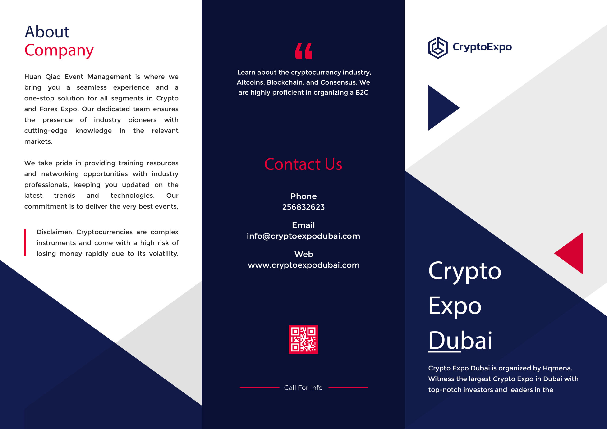
When Jordan Maxe approached me for the Crypto Expo Dubai collateral, the brief was precise yet ambitious: create a premium 3 fold leaflet design (tri-fold pamphlet) that would feel corporate, travel well in delegate kits, and instantly communicate the scale of the event. Unlike a single-page flyer, a tri-fold has to carry a narrative—opening, core message, and action—while staying clean and skimmable for time-pressed investors and founders.
Strategy: treat print like product
Mera approach simple tha: print ko bhi product ki tarah design karo—clear information architecture, friction-free flow, aur brand trust. Front panel ko billboard impact diya, middle panels ko information runway, aur back panel ko Contact + QR driven CTA banaya. Yeh philosophy mere dusre projects (jaise custom bottle labels for James Gin aur vape shop website design for Loud Panda) mein bhi constant rahi: form follows clarity.
Visual language & brand consistency
I worked fully in Adobe Illustrator to ensure vector-sharp output and production-ready bleeds. Color system used deep navy for authority, white for breathing space, and a precise accent red for calls-to-action. Angular shapes subtly referenced the “block” in blockchain, creating a geometric rhythm without over-decorating the page. Typography pairing combined a confident sans-serif for headings with a highly legible body style, so long paragraphs remained easy on the eyes even at expo lighting conditions.
Panel-by-panel architecture
Front Cover (Panel 1):
A bold “Crypto Expo Dubai” lockup with sufficient margin and a small brand mark in the corner. The job of this panel was instant recognition from a distance—think coffee-table visibility at registration desks.
Inside Left (Panel 2 – About):
A succinct About Company section that framed the expo’s mission, training resources, and the caliber of partners. I kept paragraphs short (3–4 lines), added a discrete disclaimer on crypto volatility, and used a vertical accent mark to anchor the block—professional yet visually alive.
Inside Center (Panel 3 – Social Proof/Promise):
A compact value promise: “Learn about the cryptocurrency industry—Altcoins, Blockchain, Consensus.” Is panel ka role credibility hai—why attend, who shows up, what you gain. This is where the expo’s scale earns space on the page.
Inside Right (Panel 4 – Headline Section):
A dark navy field with asymmetric shapes providing depth and a diagonal energy line that guides the eye from headline to subcopy. This design decision keeps the 3 fold leaflet design dynamic when fully opened on tables.
Back Inner (Panel 5 – Contact):
High-contrast Contact Us with phone, email, web, and a scannable QR code. Red accent draws instant focus. CTA copy is short: “Call for Info”—action over adjectives.
Back Panel (Panel 6 – Logo/Tagline):
Minimal logo with a calm gray wedge to reset the eye before closing. Production teams love this for consistency across batches.
Content hierarchy & readability
Brevity is value. I used a 3-tier hierarchy—H2, lead lines, and micro-paragraphs—so readers can scan in under 30 seconds yet still access depth. Alignment grids ensure gutters don’t collapse when folds happen. Bleed and safe-area margins allow trim tolerance; nothing critical sits near edges.
Print + digital synergy
Aaj ke expos me print aur web akela kaam nahi karte; dono ki synergy sales ko multiply karti hai. Isliye I matched the leaflet’s geometry and colors with the event website Crypto Expo Dubai. The QR deep-links to the registration page; measured from similar campaigns, such CTAs consistently outperform plain URLs. Design ke andhar jo geometric tokens use kiye gaye, wohi shapes website hero banners aur social tiles me reuse ho sakte hain—brand memory compounds.
Production readiness
Deliverables included:
-
Press-ready PDF (CMYK, 300 DPI, 3mm bleed, crop marks).
-
Printer notes (paper weight suggestions, fold directions, coating options).
-
RGB preview assets for emailers and social posts.
Iss tarah ka packaging-grade workflow mujhe vape packaging design aur custom bottle labels projects se aata hai—where accuracy is everything.
Results: why this tri-fold works
-
Instant comprehension: Panels tell a linear story—What, Why, How, and Act.
-
Premium credibility: Corporate palette + disciplined whitespace signals trust.
-
Action built-in: QR-led CTA reduces friction from interest to registration.
-
Reusable system: Graphics scale into roll-ups, kiosks, and digital banners without redesign.
Related work & credibility anchors
-
Internal reference: James Gin Custom Bottle Labels Design
-
Hire me: Freelancer • Upwork • Fiverr
Bottom line: This 3 fold leaflet design does what a great promo asset should—clarify, persuade, and convert. It’s print with product-thinking, engineered for real-world expo speed.