Packaging Design Companies Near Me
Table of Contents
-
Industry Context: Why 2025 changed local packaging
-
Services & Capabilities to demand locally
-
Scorecard: 12 evaluation points before you hire
-
Process (strategy → CAD dieline → prepress → print)
-
Visual System & Information Hierarchy
-
Compliance & Risk Controls (non-legal)
-
Print Methods, Materials & Finishes
-
E-commerce Readiness (thumbnail → PDP → unboxing)
-
Sustainability without greenwashing
-
Common Mistakes & Quick Fixes
-
Files, Color & Prepress (what printers need)
-
Timelines, MOQs & Cost Levers
-
Hire CTA + Internal Portfolio Links
Industry Context: Why 2025 changed local packaging
-
Faster cycles: DTC drops and seasonal promos need same-week proofs—local partners win with rapid comps and press checks.
-
Thumbnail commerce: PDPs must read at 120–160 px; variant/strength badges belong front and loud.
-
Color trust: Buyers expect Pantone governance with LAB targets and ΔE ≤ 2.0 reports; no more “looks close.”
-
Local + global: You may proof locally, then scale to regional plants—templates must survive vendor changes without drift.
-
Sustainability pressure: Real changes—mono-material structures, water-based coatings, right-weighted board—not vague eco talk.
Services & Capabilities to demand locally
-
Strategy & architecture: SKU/variant logic, type scales, color families; competitive shelf + thumbnail tests.
-
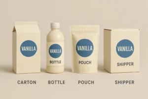
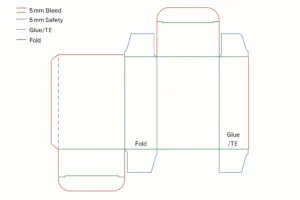
CAD dielines: cartons, labels, pouches, tubes, inserts, shippers; bleed ≥ 3 mm, safety 3–5 mm; fold/glue/TE layers.
-
Prepress governance: trapping 0.08–0.12 mm, overprint/knockout map, total ink limit per press profile.
-
Color management: Pantone master chips, LAB references, press OK with ΔE reports; CMYK simulations documented.
-
Anti-counterfeit (as needed): microtext, UV inks, serialized QR with quiet zone ≥ 2.5 mm.
-
Photo/3D content: hero angles, macro finish shots, honest renders for PDPs, optional AR.
-
Sustainability planning: mono-material swaps, caliper optimization, disposal guidance by region.
Scorecard: 12 evaluation points before you hire
-
Front hierarchy (brand → product → variant/strength → net contents).
-
Legibility (body x-height ≥ 2.6–2.8 mm; contrast ≥ 4.5:1).
-
Barcode/QR discipline (quiet zone ≥ 2.5 mm; ANSI A/B grade).
-
Bleeds & safety (≥ 3 mm bleed, 3–5 mm safety; no critical text on creases).
-
Trapping (0.08–0.12 mm at ink joins; small text ≤ 8 pt forced knockout).
-
Color control (Pantone + LAB; ΔE ≤ 2.0 vs master).
-
Material fitness (board/film meets scuff/crush/barrier needs).
-
Finish discipline (foil/spot gloss away from warnings/codes).
-
E-comm readability (variant readable at 120–160 px).
-
Sustainability honesty (recycled %, mono-material feasibility, real disposal info).
-
Version control (rev codes on artboard; change logs).
-
Vendor readiness (at least two approved plants mapped to the same spec).
Process (Strategy → CAD Dieline → Prepress → Print)
-
Strategy & brief
Audience, channels (retail vs DTC), regions, volumes. Align KPIs (sell-in vs sell-through). -
Content matrix
Lock mandatory copy order: claims, ingredients/actives, warnings, certifications, batch/expiry windows. Pre-count characters. -
Master visual system
12-column grid, type ramp (H1/H2/body/captions), icon family (dose, recycle, QR), color logic per variant. -
CAD & mechanics
Build dielines with 3 mm bleed and 5 mm safety; annotate fold/glue/TE; reserve barcode/QR zones; include overprint/knockout legend on pasteboard. -
Prototypes & tests
White dummies + printed comps; check hinge/tuck behavior, rub/scuff, barcode scans, shelf/thumbnail legibility. -
Prepress
Images 300 ppi @100%; line art 1200 ppi; trapping 0.08–0.12 mm; rich black for solids only (e.g., C60 M40 Y40 K100); small text = knockout. -
Color sign-off
Hard proof with LAB targets and ΔE readouts; no approval beyond tolerance. -
Press & QC
Press OK, ΔE report, barcode grades, coating weights; photograph samples for future matching. -
Handover kit
Final PDFs (PDF/X-1a or X-4), source files, color bible, preflight report, revision log—so any local plant can reprint clean.
Visual System & Information Hierarchy
-
Top band: brand + product family.
-
Primary signals: variant/strength badge, 1–2 word RTB, count/volume.
-
Secondary: certifications, sustainability icons, usage pictograms.
-
Tertiary: ingredients/nutrition/actives tables, legal line, batch/expiry windows.
-
Color coding: never color-only—add pattern or alphanumeric code; protect small text on white/95% tints.
-
Micro layout: codes 6–8 mm from edges/folds; align baselines around panels for a premium feel.
Compliance & Risk Controls (non-legal)
-
Maintain a controlled master copy with version history; export by market if regulations vary.
-
Don’t rely on color alone where safety or strength matters—pair with symbols.
-
Reserve UID/serialization space even if not used at launch.
-
Add tamper cues (arrows, “Lift to open”) if TE is present.
-
Print disposal guidance relevant to key regions; amplify with QR micro-site.
(Guidance only—verify with your regulatory counsel.)
Print Methods, Materials & Finishes
-
Litho offset (cartons/inserts): crisp micro-type, accurate color.
-
Flexo (labels/corrugate): efficient for volume; manage plate counts.
-
Digital (Indigo/inkjet): pilots, low MOQs, variable data.
-
Materials: SBS/FBB 300–400 gsm; corrugate (E/B flute) for shippers; films (BOPP/PET/PE) where barrier is required.
-
Finishes: aqueous matte/satin for cleanability, soft-touch sparingly (shows scuffs), spot gloss away from warnings, cold foil for accents, emboss/deboss aligned to grain.
-
Security (if relevant): UV inks, microtext, guilloché, tamper labels.
E-commerce Readiness (thumbnail → PDP → unboxing)
-
Thumbnail: variant readable at 120–160 px; plain background; avoid tiny claims.
-
PDP gallery (6–8 images): hero, side info table, macro of finish, barcode/QR placement with highlighted quiet zone, inside-lid or leaflet view, size in hand, pallet/shipper.
-
Downloads: AI/PDF dielines, prepress checklist, color bible, disposal guide.
-
Unboxing: inside-lid quick-start or insert; QR to short how-to video.
-
Color honesty: renders must match print within ΔE tolerance—no oversaturation.
Sustainability without greenwashing
-
Right-weighting: reduce caliper where compression allows; publish gram savings.
-
Mono-material: paper trays instead of mixed laminations where feasible.
-
Coatings: water-based over plastic laminations unless barrier is needed.
-
Design for disassembly: avoid glued mixed materials; print clear disposal icons; QR to regional instructions.
-
Claim discipline: recycled % and certifications only—no vague “eco friendly.”
Common Mistakes & Quick Fixes
-
Artwork doesn’t fit machinery → Add chamfers on tight folds; validate glue flaps and tuck lengths.
-
Barcode fails → Move off seams; increase contrast; protect quiet zone ≥ 2.5 mm; re-grade to A/B.
-
Overprint on fine text → Force knockout ≤ 8 pt; audit Overprint Preview.
-
Color drift across printers → One color bible; press OK per plant; enforce ΔE ≤ 2.0.
-
Scuffed cartons → Increase coating weight or switch to satin; test against shipper rubs.
-
Slow PDP conversions → Add dieline blueprint + prepress tab; keep RFQ sticky.
Files, Color & Prepress (what printers need)
-
Finals: PDF/X-1a or X-4; fonts outlined; embed profiles; archive sources.
-
Layers (non-printing): dieline, fold, glue, varnish, foil, emboss, white ink, security, barcode/QR zones, overprint/knockout legend.
-
Bleed ≥ 3 mm; safety 3–5 mm; no critical text near creases.
-
Images 300 ppi; line art 1200 ppi; total ink limit per press profile.
-
Pantone governance: book name + LAB; ΔE ≤ 2.0.
-
Barcodes/QR: magnification, height, location; quiet zone ≥ 2.5 mm; sample scans.
-
Preflight report: color spaces, overprints, fonts, resolution, trim/bleed boxes.
Timelines, MOQs & Cost Levers
-
Strategy + system: 1–2 weeks
-
CAD + comps: 5–7 days
-
Prepress + proofs: 3–5 days
-
Printing: digital 3–5 days; offset 10–14 days incl. drying & QC
-
MOQs: digital 100–500; offset 5k–20k; flexo labels 5k+
-
Levers: shared dies, standardized calipers, fewer spot colors, gang runs, localize artwork—not structure; dual-source vendors.
Hire CTA + Internal Portfolio Links
Looking for packaging design companies near me that deliver clean prepress and scalable supply? Hum karein? We’ll build your master templates, control color, and ship factory-ready files—fast and reliable.
-
Supplements & label systems (regulated hierarchy discipline):
https://usmandesigner.com/portfolio/supplement-label-design-freelancer/ -
High-fidelity consumer packs & 3D visuals:
https://usmandesigner.com/portfolio/vape-packaging-design-store/ -
Premium cartons & complex dielines:
https://usmandesigner.com/portfolio/sushi-packaging-design/FAQs
1) What should I look for when shortlisting packaging design companies near me?
A provable prepress process (bleeds, trapping, knockout rules), Pantone LAB targets with ΔE reporting, and vendor-agnostic templates that can scale.2) Do I really need Pantone, or can I stick to CMYK?
Anchor brand colors with Pantone + LAB; you can simulate CMYK if the press proof meets ΔE ≤ 2.0.3) What causes barcode failures at warehouses?
Missing quiet zones, low contrast, or codes placed on folds. Grade to A/B before approval.4) How big should bleeds and safety margins be?
Use ≥ 3 mm bleed and 3–5 mm safety on all sides; keep small text off creases.5) Can I reduce packaging impact without retooling everything?
Yes—right-weight caliper, switch to water-based coatings, prefer mono-material trays, and add disposal guidance via QR.6) When is digital printing better than offset?
For pilots/variable data/low MOQs. Offset wins for steady SKUs with tighter unit cost and stricter color consistency.7) How do I avoid color drift across local printers?
Share one color bible, demand press OK at each plant, and enforce ΔE ≤ 2.0 with documented LAB targets.