Packaging and Design Companies: How to Choose a Partner That Ships Strategy → Structure → Sales
If you’re searching for packaging and design companies, you’re beyond “nice graphics.” You want a partner that translates your brand strategy into the right structure and materials, a clear front-panel hierarchy, and press-ready files that perform on shelf and on a 6-inch screen. This long-form guide walks you through services to expect, how to evaluate agencies, realistic timelines/costs, red flags, image prompts, FAQs, and full Rank Math data.
Table of Contents
-
What Packaging and Design Companies Actually Do
-
Services to Expect (End-to-End)
-
Scorecard: How to Evaluate a Company
-
Process: From Brief to Print (Step-by-Step)
-
Industries & Use Cases
-
Pricing & Timelines (What Moves the Needle)
-
E-commerce Readiness: Thumbnails to Unboxing
-
Sustainability Without Green-washing
-
Common Mistakes & Quick Fixes
-
Image Prompts (Hero, System, Eco, Dieline, Map)
-
FAQs
-
Rank Math Data (Copy-Paste)
1) What Packaging and Design Companies Actually Do
Great companies connect four pillars:
-
Strategy – positioning, audience triggers, message hierarchy, 2–3 proof claims.
-
Structure – dielines, formats (pouch/carton/jar/tube), inserts, closures, barrier specs (OTR/WVTR), shipping reality.
-
Visual System – type pairing, color logic by variant, iconography, imagery style, modular grids.
-
Production – compliance (nutrition/INCI/allergens), prepress, vendor liaison, proofs, consistent 3D renders, e-commerce image kits.
See structure + bold color logic in action: Sushi Packaging Design →
2) Services to Expect (End-to-End)
Category & Shelf Audit
-
Identify category codes to respect vs. break; define whitespace your brand can own.
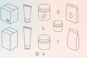
Structure & Dielines
-
Box styles, pouches, sleeves, trays, inserts, closures. Vendor-ready dielines with assembly notes; stack tests and freight considered.
Materials & Barriers
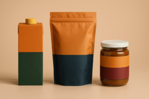
-
Paperboard/kraft, laminates tuned for oxygen/moisture, glass/metal, MAP/vacuum for perishables.
Visual Territories & System
-
Benefit-first front, variant color rules, icon grid (halal/vegan/non-GMO/recyclable), imagery/3D style, grid for rapid SKU expansion.
Compliance & Localization
-
Nutrition/INCI, allergens, barcodes, batch/lot, certs, translations. Locked Compliance Layer aligned to the dieline.
Prepress & Production
-
CMYK/spot strategy, trapping, overprint, barcode sizing, proof workflow; first-article checks.
E-commerce Kit
-
Consistent hero angles, angled back (compliance), lifestyle, in-hand scale, and short unboxing GIF.
Versioning & Extensions
-
Seasonals, multipacks, retailer stickers—without breaking the system.
3) Scorecard: How to Evaluate a Company (0–5 Each)
-
Structure literacy – Can they talk dielines, closures, and barrier films (OTR/WVTR)?
-
Visual hierarchy – Brand → Variant (largest) → Benefit → 2–3 proof icons → Net weight.
-
Compliance discipline – Nutrition/INCI, allergens, barcodes, certs, translations.
-
E-com readiness – Thumbnail legibility at 120×120 px, gallery logic, hero angle consistency.
-
Prepress hygiene – Color management, trapping/overprint, barcode tests, proof flow.
-
System thinking – Will new SKUs slot in without redesign chaos?
-
Sustainability insight – Right-sizing, mono-materials, honest end-of-life guidance.
Shortlist your top two based on total score.
4) Process: From Brief to Print (Step-by-Step)
-
Discovery & Brief – goals, channels (retail/DTC/q-commerce), claims, unit economics.
-
Shelf Audit – 3–5 competitors + 2 adjacents for inspiration.
-
Structure First – lock dielines, materials, closures, and compliance zones before color/type.
-
Concept Territories (2–3) – distinct layouts stress-tested at thumbnail size.
-
Refinement + Compliance – nutrition/INCI, allergens, barcodes, certs, translations.
-
Prepress Setup – CMYK/spot, trapping, overprint, barcode scale; soft/hard proofs.
-
Production & QA – vendor liaison, stock/ink tweaks, first-article approval.
-
Launch Assets – 3D renders, lifestyle frames, PDP kit, unboxing GIF, social cutdowns.
5) Industries & Use Cases
-
Food & Beverage – snacks, confectionery, specialty teas/coffees.
-
Supplements/Nutraceuticals – capsules, powders, liquids.
-
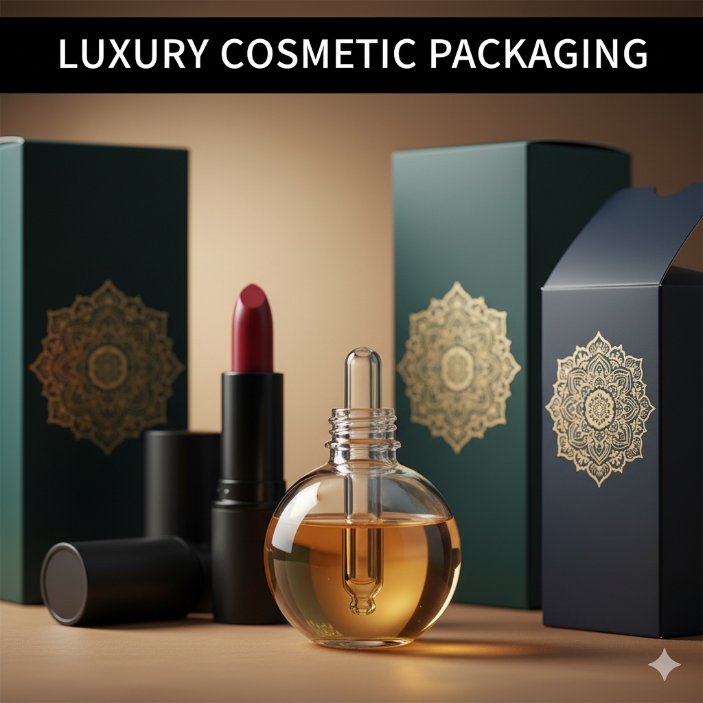
Cosmetics & Personal Care – serums, cleansers, hair care.
-
Vape/CBD/Novelty – high-contrast systems with regulation awareness.
-
Home & Lifestyle – candles, décor, gift sets.
Portfolio tone examples:
-
Food: Sushi Packaging Design
-
Supplements: Dog Supplement Label Design
-
High-impact variants: Vape Packaging Design Store
-
More supplement work: Supplement Label Design Freelancer
6) Pricing & Timelines (What Moves the Needle)
-
Typical timeline: 3–8 weeks (quicker for single-SKU refresh; longer for multi-language or complex finishes).
-
Cost drivers:
-
SKU/variant count & localization
-
Finish level (soft-touch, foil, spot UV), custom inserts
-
Regulatory complexity (nutrition/INCI, certs)
-
Photography/3D asset depth & e-commerce kit
-
Rush or retailer-specific demands
-
-
Smart savings: one base structure + variant labels; right-size packs; limit plate count; standardized angles for renders.
7) E-commerce Readiness: Thumbnails to Unboxing
-
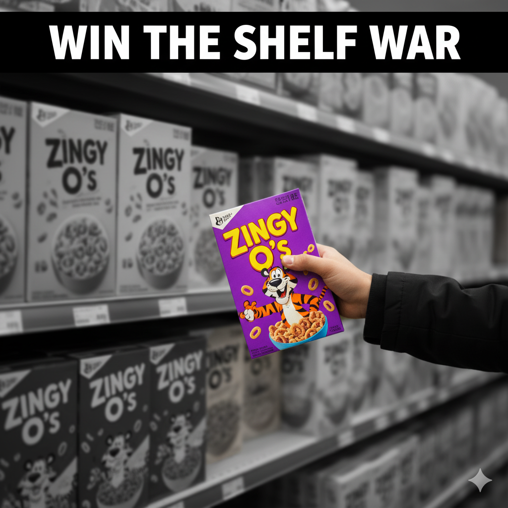
Front panel = poster. Bigger variant name, bold color band, three proof bullets → stronger CTR.
-
PDP gallery: front hero, angled back (compliance), lifestyle, in-hand scale, short unboxing GIF.
-
Consistency: same camera angle/lighting across SKUs builds trust and repeat buys.
-
3D first: renders create a unified line for marketplaces; swap to photos after the shoot.
8) Sustainability Without Green-washing
-
Right-size and reduce void/ink plates.
-
Prefer mono-materials for simpler recycling streams.
-
Be specific about end-of-life (“recycle where facilities exist”); avoid vague claims.
-
Test finishes on actual stock—some foils/laminates affect recyclability.
9) Common Mistakes & Quick Fixes
-
Everything screams on front. → Enforce hierarchy; move story to side/back.
-
Variant chaos. → Lock color bands, icon grid, and naming convention.
-
Barcode misreads. → 100% black on white, quiet zone intact, size test at print scale.
-
Grease bleed on kraft. → Specify grease-resistant liners or change stock.
-
Thumbnail mush. → Larger variant, fewer words, higher contrast.
11) FAQs
Q1. What’s the difference between packaging and design companies vs. a general graphic studio?
Packaging companies handle structure, materials, compliance, and production—not just surface graphics.Q2. Will they manage printers and proofs?
Good partners set up prepress, coordinate proofs, and approve the first article with your vendor.Q3. How long does a typical project take?
Usually 3–8 weeks, depending on SKUs, finishes, compliance, and vendor lead times.Q4. Can a company help with e-commerce images?
Yes—consistent 3D renders, back-of-pack, lifestyle, in-hand scale, and an unboxing GIF are standard.Q5. How do I keep variants consistent at scale?
Use a style guide with color assignments, icon sizes, claim zones, template grids, and a locked Compliance Layer.Q6. What files should I receive at the end?
Press-ready PDFs on final dielines (1:1), layered source files, a style guide, 3D renders/PNGs, and a PDP image kit.
Hire a Company That Ships Results
Want a partner that handles strategy → structure → prepress → launch assets? Start here: