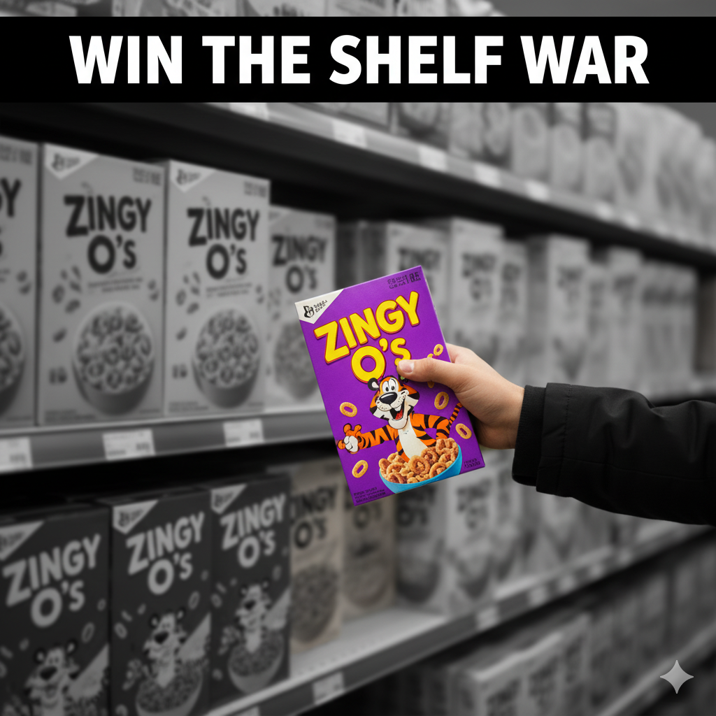
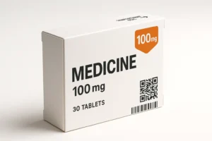
Medicine Design Packaging
Medicine design packaging is where healthcare safety, clarity, and brand trust meet practical realities of printing, compliance, and last-mile delivery. In 2025, faster telehealth, e-pharmacies, and sustainability pressures mean your pack must be legible at arm’s length, scan perfectly on cameras, and stay tamper-evident from warehouse to home. This guide shows exactly how to plan, design, spec, and launch medicine design packaging that passes audits and sells confidently—seedha, no fluff.
Table of Contents
-
Industry Context: Why 2025 is different
-
Core Services & Features of Medicine Packaging
-
Scorecard: 12 Evaluation Points
-
End-to-End Process (strategy → dieline → print)
-
Visual System & Information Hierarchy
-
Compliance & Risk Controls (non-legal)
-
Print Methods & Finishes That Work
-
E-commerce Readiness (thumb → PDP → unboxing)
-
Sustainability Without Greenwashing
-
Common Mistakes & Quick Fixes
-
Files, Color & Prepress: What Printers Need
-
Timelines, MOQs & Cost Levers
-
Hire Us + Portfolio Links
Industry Context: Why 2025 is different
-
Telehealth & e-pharmacies compress decision time; packs must be photo-ready for PDPs and camera-scannable (barcodes/QR).
-
Serialization & authenticity expectations are rising; even smaller brands are adding unique QR/UID and tamper labels.
-
Accessibility is non-negotiable: large x-height fonts, color-contrast > 4.5:1, tactile cues, and clear dosage hierarchy.
-
Sustainability now demands real impact—lighter substrates, mono-materials, printed instructions vs extra leaflets, and recyclability by region.
-
Rapid iterations mean dielines must be master-templated for fast line extensions (strengths, SKUs, flavors).
Core Services & Features of Medicine Packaging
-
Regulated copy architecture: panel order, dosage, warnings, storage, batch/expiry fields.
-
Dieline development for bottles, cartons, sachets, blister cards, shipper boxes.
- 3D Renderings
-
Tamper-evident systems: perforation, TE seals, induction seals, shrink bands.
-
Color governance: Pantone master, ΔE ≤ 2.0 across SKUs, controlled overprint/knockout.
-
Anti-counterfeit: microtext, guilloché, UV inks, serialized QR linking to your verification page.
-
E-comm optimization: hero angle, readable at 120 px thumbnails, shadow-safe mockups.
-
Sustainable specs: FSC papers, mono-material trays, water-based coatings.
Scorecard: 12 Evaluation Points
-
Front-panel hierarchy (brand → product → strength → dosage form).
-
Readability (x-height ≥ 2.8 mm body; dosage ≥ 3.2 mm).
-
Contrast (≥ 4.5:1 for text on color).
-
Barcode quiet zone (≥ 2.5 mm all sides) + scan success ≥ 99%.
-
QR destination (auth page + dosage recap; loads < 1.5s).
-
Tamper evidence (visible + instructional arrowing).
-
Color accuracy (ΔE ≤ 2.0 vs master; Pantone chips logged).
-
Bleed & safety (bleed ≥ 3 mm; safety margin ≥ 3–5 mm).
-
Trapping (0.08–0.12 mm where required; avoid fine type overprints).
-
Serialization field (clear zone reserved; human-readable fallback).
-
Material choice (tear strength, MVTR/oxygen barrier if needed).
-
E-comm thumbnails (legible strength at 120–160 px edge).
End-to-End Process (Strategy → Dieline → Prepress → Print)
-
Discovery & risk map: dosage form, stability, storage, markets, line extensions.
-
Content matrix: lock mandatory text, order, and character counts; decide front vs side panels.
-
Master visual system: color by strength, icon set, grid (e.g., 12-col), type scale.
-
Dieline creation: CAD carton/bottle; add 3 mm bleed, 5 mm safety, TE mechanics, hang holes if retail.
-
Prototyping: white dummy + printed mockups; test legibility at arm’s length and in low light.
-
Prepress:
-
Convert spot/Pantone per plan; define overprint/knockout rules.
-
Trapping 0.08–0.12 mm where two inks meet.
-
Raster images 300 ppi at 100%.
-
Barcodes ISO/ANSI grade A/B; quiet zone ≥ 2.5 mm.
-
-
Reg review (internal): cross-check warnings, dosage, storage, batch/expiry placeholders.
-
Press proof: hard proof with ΔE readouts; approve only if within tolerance.
-
Line trial: verify fit, TE performance, serialization print windows.
-
Handover: final locked PDFs + color targets + QC checklist for every reprint.
Visual System & Information Hierarchy
-
Top band: brand and product class.
-
Primary callouts: strength (e.g., 500 mg), dosage form (tablets/syrup), units.
-
Secondary: indications (short), key warnings iconized, count per pack.
-
Back/side: dosage directions table, storage, contraindication bullets, batch/expiry windows.
-
Color coding: one hue per strength; reserve white or 95% tint zones for small text.
-
Icons: dose frequency, age band, storage temp; keep line style consistent.
Compliance & Risk Controls (High-Level, Non-Legal)
-
Keep a master controlled copy for text; version every change.
-
Do not rely on color alone for strength differentiation—add pattern or icon.
-
Child-resistance: pair CR closures with clear pictograms for opening steps.
-
Reserve serialization/UID area for future market needs.
-
Add tamper instructions near the opening edge (“Do not use if seal broken”).
(Note: This is guidance, not legal advice. Always validate with your regulatory team.)
Print Methods & Finishes That Work
-
Litho offset for cartons; flexo for labels; digital for low MOQs/variable data.
-
Finishes: aqueous or water-based varnish for healthcare feel; soft-touch sparingly (soil visibility).
-
Spot gloss only on non-critical areas (avoid over warnings).
-
Security: UV invisible inks, microtext on seals, holographic threads if needed.
E-commerce Readiness (Thumbnail → PDP → Unboxing)
-
Thumbnail (120–160 px): keep strength value big; avoid busy backgrounds.
-
PDP: 5–7 images—front, side (directions), TE detail, scale in hand, QR verification screen.
-
Unboxing: one step-by-step panel for TE removal; include a leaflet QR linking to dosage video.
-
Retouching: maintain ΔE vs real pack; no misleading saturation.
Sustainability Without Greenwashing
-
Prioritize mono-material structures (carton + paper tray).
-
Switch to water-based coatings; avoid mixed laminates unless barrier is essential.
-
Rightweighting: reduce board caliper where compression allows.
-
Print disposal instructions relevant to major markets without over-claiming.
-
Consider recyclable TE labels and digital leaflets via QR to reduce inserts.
Common Mistakes & Quick Fixes
-
Tiny dosage text → Increase x-height; reflow grid.
-
Barcode fails → Rebuild vector, check quiet zone, print at ≥ 80% size.
-
Overprints on small type → Force knockout for text ≤ 8 pt.
-
Color drift → Lock Pantone, request press OK and ΔE report.
-
Leaflet overload → Move stable content to QR microsite, keep critical on-pack.
-
Weak TE → Add perforation direction arrows and “Lift to open” copy.

Files, Color & Prepress: What Printers Need
-
Final PDF/X-1a or X-4 with fonts outlined (keep live copy master on file).
-
Bleed ≥ 3 mm, safety 3–5 mm; dieline, fold, glue, and TE layers on separate non-printing layers.
-
Images 300 ppi; line art 1200 ppi.
-
Pantone book name + LAB values; define tolerances ΔE ≤ 2.0.
-
Barcodes: EAN/UPC at spec height; assign no scaling on press.
-
Serialization: variable text fields tested in RIP.
-
Overprint/knockout map shared as a legend on pasteboard.
Timelines, MOQs & Cost Levers
-
Strategy + content: 1–2 weeks.
-
Dielines + system: 1 week.
-
Prepress + proofs: 3–5 days.
-
Printing: digital 3–5 days; offset 10–14 days incl. drying & QC.
-
MOQs: digital from 100–500; offset typically 5k–20k.
-
Cost levers: unify board calipers, reduce spot colors, gang-run SKUs, standardize TE labels, design for mono-material.
Hire Us + Portfolio Links
Need a compliant, clean medicine design packaging system that scales? Let’s build your master template, lock compliance, and ship faster—bina tension.
-
Supplements & labels (regulated layout discipline):
https://usmandesigner.com/portfolio/supplement-label-design-freelancer/ -
High-fidelity consumer packs (brand storytelling + precision):
https://usmandesigner.com/portfolio/vape-packaging-design-store/ -
Food/retail carton craft (complex dielines, premium finishes):
https://usmandesigner.com/portfolio/sushi-packaging-design/FAQs
1) What is the ideal font size for dosage and warnings?
Aim for body x-height ≥ 2.8 mm, dosage and strength ≥ 3.2 mm, with contrast ≥ 4.5:1.2) How do I ensure barcodes scan reliably?
Keep quiet zones ≥ 2.5 mm, print at spec magnification, and test to ISO/ANSI grade A/B. Avoid placing varnish or metallics directly under codes.3) Do I need Pantone or is CMYK enough?
For consistent strength colors, lock a Pantone master with LAB values. You can simulate in CMYK if ΔE ≤ 2.0 on press proofs.4) What should a tamper-evident system include?
A visible seal with clear opening arrows, perforation or shrink band, and on-pack instruction. Test during line trials.5) Can I reduce leaflets without compliance risk?
Yes—keep critical instructions on-pack and use a QR micro-site for extended guidance and videos. Always confirm with your regulatory team.6) What’s the best material for medicine cartons?
FSC SBS 300–400 gsm for strength and printability; consider mono-material paper trays. Add aqueous coating for cleanability.7) How do I manage multi-SKU color drift?
Set a color bible, specify ΔE tolerance, request press OK with readouts, and keep chip swatches for every reprint.