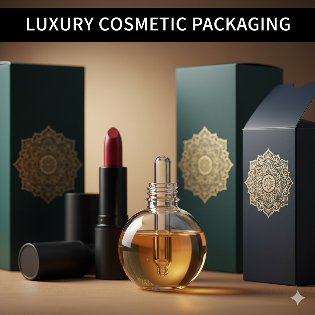
Luxury Packaging Design Agency
Table of Contents
-
Industry Context: Why luxury is different in 2025
-
Services & Signature Capabilities of a luxury packaging design agency
-
Scorecard: 12 evaluation points before you approve
-
Process (strategy → dieline → prepress → press)
-
Visual System & Hierarchy for premium brands
-
Compliance & Risk Controls (non-legal, high-level)
-
Print Methods & Luxury Finishes
-
E-commerce Readiness (thumbnail → PDP → unboxing)
-
Sustainability (real impact, no greenwashing)
-
Common Mistakes & Quick Fixes
-
Files, Color & Prepress (what printers need)
-
Timelines, MOQs & Cost Levers
-
Hire CTA + Internal Portfolio Links
Industry Context: Why luxury is different in 2025
-
Silent signals, loud standards. Luxury buyers notice micro-kerning, foil registration, edge paint neatness, and the “thunk” of a magnetic closure. Ops teams need the same beauty to pass on a pallet.
-
Omnichannel parity. Packs must feel couture in store and read premium at 120–160 px online. Macro shots should show controlled grain, deboss depth, and finish texture.
-
Color truth. Pantone LAB mastering with ΔE ≤ 2.0 is baseline; special blacks and metallics must be disciplined to keep contrast and legibility.
-
Sustainable excellence. Premium doesn’t equal plastic-heavy anymore—mono-material paperboard, water-based coatings, and honest end-of-life guidance lead.
-
Speed with craft. Seasonal drops and collabs need a reusable master system: shared dies, repeatable finishes, and vendor-agnostic color bibles.
Services & Signature Capabilities of a Luxury Packaging Design Agency
-
Brand architecture & narrative systems: house line vs limited editions; collector cues; edition marks.
-
Structural design: rigid set-up boxes, shoulder boxes, drawer trays, hinged lids, inserts, bottle cradles, perfume collars.
-
Material curation: FBB/SBS (350–600 gsm), greyboard with wrapped special papers (cotton, linen, pearlescent), fine textiles, molded fiber.
-
Finish repertoire: hot/cold foil, multi-level emboss/deboss, edge painting, soft-touch/eggshell varnish, micro-grain patterns, duplex papers.
-
Color governance: Pantone masters + LAB; rich black strategy for deep fields; ΔE reports per plant.
-
Security & authenticity: serialized QR with quiet zone ≥ 2.5 mm, microtext, UV fibers, tamper labels aligned to opening ritual.
-
Prepress discipline: bleeds (≥3 mm), safety (3–5 mm), trapping (0.08–0.12 mm), overprint/knockout maps, foil/varnish/emboss plates on named layers.
-
E-commerce suite: premium hero lighting, macro finish images, AR turntable, unboxing storyboard.
Scorecard: 12 Evaluation Points Before You Approve
-
Front hierarchy (brand crest → line name → product → size).
-
Readability (contrast ≥ 4.5:1 for small copy, even over textures).
-
Finish stack (foil/emboss/varnish order avoids cracking & halo).
-
Edge quality (wrap corners, miters, or edge paint tolerance).
-
Magnetic/closure spec (pull force and alignment → no auto-open).
-
Insert fit (tolerance for glass/jar wobble; no rattling).
-
Barcode/QR (ANSI A/B; quiet zone ≥ 2.5 mm; discreet placement).
-
Color control (Pantone LAB + ΔE ≤ 2.0; rich black policy defined).
-
Bleed & safety (≥3 mm bleed, 3–5 mm safety; folds clear of micro-type).
-
Trapping & overprint (0.08–0.12 mm; small text = knockout).
-
Drop/stack & scuff (rigid box corners pass rub tests; coating weight adequate).
-
Sustainability (mono-material where possible; credible disposal guidance).
Process (Strategy → Dieline → Prepress → Press)
-
Discovery & narrative
-
Audience, ritual, shelf vs boutique vs DTC, edition strategy. Map how luxury is felt: weight, sound, reveal timing.
-
-
Content matrix
-
Legal/INCI, batch/expiry windows, claims discipline, authenticity messaging.
-
-
Master system
-
Reusable rigid box family (shoulder/drawer/hinge), shared inserts, shared magnet specs, edition foil plates.
-
-
CAD & mechanics
-
Rigid CAD with wrapped-paper allowances; define 3 mm bleed art; 5 mm safety; glue paths; ribbon pulls; finger notches; lift tabs.
-
-
Material boards & comps
-
Build tactile kits: paper swatches, foils, varnish chips, emboss depth ladders.
-
-
Prepress
-
Vectorize foil/emboss plates; trapping 0.08–0.12 mm; overprint/knockout legend; images 300 ppi; line art 1200 ppi; total ink limits.
-
Barcode/QR spec with quiet zone; placement off seams; test scans.
-
-
Color mastering
-
LAB targets; press proofs; ΔE readouts; lock rich black recipe for solids (e.g., C60 M40 Y40 K100) not for micro-type.
-
-
Pilot & line trial
-
Assembly timing, corner wrap quality, foil register, scuff resistance.
-
-
Press & QC
-
Wet proofs, makeready checks, coating weights; collect ΔE and barcode grades.
-
-
Handover kit
-
Final PDFs (PDF/X-1a or X-4), die/plate files, color bible, finish stack diagram, preflight and revision log.
Visual System & Hierarchy for Premium Brands
-
Top band: brand mark with breathing room; no crowding.
-
Primary signal: line/edition callout; limited/numbered badge.
-
Secondary: product name + size; one decisive RTB (e.g., “Small-batch No. 12”).
-
Tertiary: provenance line, batch/serial window, discreet barcode/QR.
-
Typography: optical kerning for display; generous tracking; minimum text size tested on textured stocks.
-
Grids: 12-column baseline; align panels across all sides; interior reveal (inside print, tissue, note card) follows same rhythm.
Compliance & Risk Controls (Non-Legal, High-Level)
-
Maintain a controlled master copy and versioning for every edit.
-
Claims discipline: avoid over-claiming; keep substantiation on QR microsite.
-
Do not rely on color alone for line/edition differentiation—pair with patterns or numerals.
-
Reserve UID/serialization fields for authenticity and returns.
-
Add tamper cues only where appropriate (perfume/cosmetic seals).
(Guidance only—confirm with your regulatory counsel.)
Print Methods & Luxury Finishes
-
Litho offset on coated/uncoated specials for absolute micro-type control.
-
Foil (hot/cold) with correct heat/pressure dwell; multi-level emboss/deboss for tactility.
-
Texture coats: soft-touch, eggshell, micro-sand; specify scuff performance.
-
Edge treatments: painted edges, foil edges (check crack risk at corners).
-
Papers & boards: cotton, linen, pearlescent, color-dyed through; rigid greyboard core right-weighted for weight vs cost.
-
Security: microtext rings inside foil area; UV fibers in paper; tear-proof authenticity labels.
E-commerce Readiness (Thumbnail → PDP → Unboxing)
-
Thumbnail: recognizable crest/edition at 120–160 px; clean background.
-
PDP gallery (7–9 images): hero, macro of foil/emboss edge, inside print reveal, edge paint, barcode/QR discreet placement, in-hand scale, pack on plinth, dieline blueprint.
-
Unboxing flow: photo sequence—lid lift → tissue → note card → product cradle; QR to provenance or craft film.
-
Color honesty: renders equal real print within ΔE tolerance; avoid over-saturating metallics.
Sustainability (Real Impact, Not Greenwashing)
-
Choose mono-material paper systems when possible (rigid + paper inserts).
-
Prefer water-based coatings; limit plastic films to essential barrier windows.
-
Right-weight cores; publish gram reductions with each revision.
-
Disposal guidance printed inside lid (elegant icons); QR to regional instructions.
-
Consider molded fiber or paper pulp cradles dyed to match brand color (LAB-controlled).
Common Mistakes & Quick Fixes
-
Foil halo/overburn → Reduce dwell/pressure; add micro-trapping to borders.
-
Edge cracking on wraps → Increase paper flexibility; adjust corner miters; test climate variability.
-
Scuffed soft-touch → Switch to eggshell/satin or raise coating weight; add transit tissue.
-
Loose inserts → Re-spec tolerance; add micro-tabs or ribbon pulls.
-
Barcode kills vibe → Relocate to base/side; maintain quiet zone ≥ 2.5 mm; keep contrast high but discreet.
-
Color drift between editions → Enforce ΔE ≤ 2.0; one color bible; press OK at each plant.

Files, Color & Prepress (What Printers Need)
-
Finals: PDF/X-1a or X-4; fonts outlined; profiles embedded; live source archived.
-
Layering: dieline/fold/glue, foil, emboss/deboss, varnish/texture, white ink, security, barcode/QR, overprint/knockout legend.
-
Bleed & safety: ≥ 3 mm bleed; 3–5 mm safety; keep micro-type away from creases/edges.
-
Images & lines: 300 ppi images @100%; 1200 ppi line art; total ink limit per press.
-
Pantone governance: book + LAB; rich black recipe defined for solids; micro-type = 100K or CMYK knockout, never rich black.
-
Barcodes/QR: location, magnification, height; quiet zone ≥ 2.5 mm; sample scans included.
-
Preflight report: overprints, fonts, resolution, trim/bleed boxes, finish plates named consistently.
Timelines, MOQs & Cost Levers
-
Strategy & narrative: 1–2 weeks
-
CAD + material boards + comps: 1–2 weeks
-
Prepress + proofs: 4–7 days
-
Pilot + line trial: 5–10 days
-
Production: digital pilots 3–5 days; offset & finishing 14–28 days depending on foil/emboss queues
-
MOQs: digital 100–300 (pilots/LE); offset rigid sets often 2k–10k
-
Cost levers: shared dies, standardized magnet specs, restrained color count, duplex papers vs full wraps, localizing artwork—not structure.
Hire CTA + Internal Portfolio Links
Building an iconic box that feels like a keepsake? Work with a luxury packaging design agency that treats craft and compliance with equal love. We lock color, finishes, and structure so every unboxing feels premium—without press-room drama.
-
Label & supplement systems (tight hierarchy, premium finish control):
https://usmandesigner.com/portfolio/supplement-label-design-freelancer/ -
High-fidelity consumer packs & 3D renders:
https://usmandesigner.com/portfolio/vape-packaging-design-store/ -
Complex carton craftsmanship & dielines (food/luxury):
https://usmandesigner.com/portfolio/sushi-packaging-design/FAQs
1) What defines a great luxury packaging design agency?
A studio that balances narrative, structure, and prepress—foil/emboss mastery, strict LAB/ΔE color control, and vendor-agnostic specs.2) Which finishes feel premium without being fragile?
Eggshell or satin varnish with crisp hot foil and controlled deboss; use soft-touch sparingly to avoid scuff issues.3) How do you keep barcodes discreet on luxury packs?
Place on base/side with quiet zone ≥ 2.5 mm, maintain contrast, and keep scale within ANSI A/B—functional yet subtle.4) Are rigid boxes always the answer?
Not always. Duplex cartons with strong inserts can feel luxe with the right finish stack—use rigid for keepsake moments or heavy glass.5) How can luxury and sustainability coexist?
Mono-material paper systems, water-based coatings, molded fiber inserts, right-weighted cores, and clear disposal guidance via QR.6) What’s the quickest way to prototype a premium feel?
Produce a finish deck: foil tests, emboss ladders, coated vs uncoated stock swatches, and a color proof with LAB targets.7) Why do some foils look dull online?
Metallics get misrepresented with heavy post; shoot macro with angled light, add a neutral reflect card, and keep color grading honest.