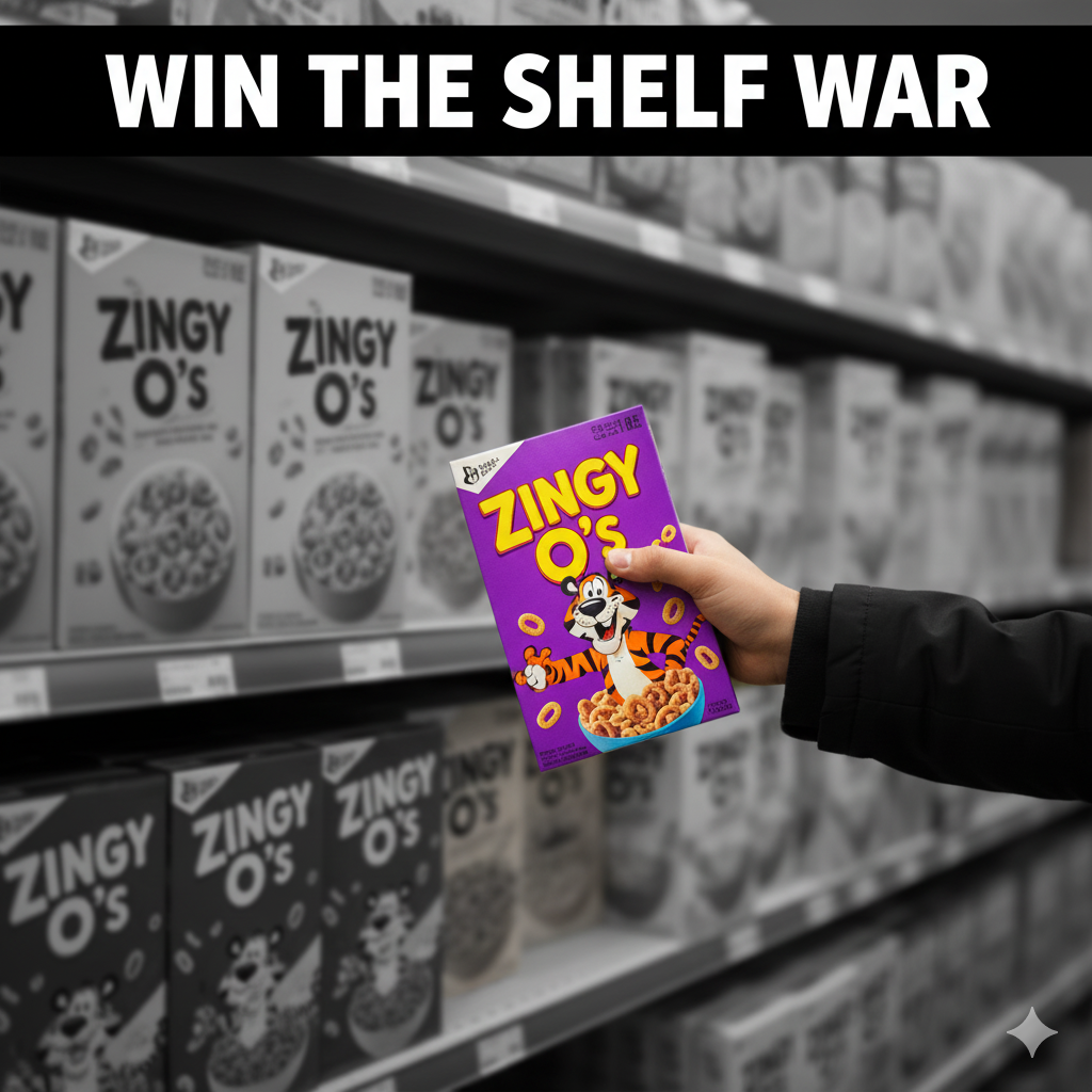
Graphic Design Packaging: Typography, Color & Conversion (Not Just “Pretty”)
Graphic design packaging is where your visuals do the heavy lifting—turning brand strategy into a 5-second read that wins on shelf and at 120×120 px online. This 2025-ready guide covers hierarchy, typography, color systems, imagery, iconography, compliance, print production, and e-commerce assets—so your packaging looks premium and performs.
Table of Contents
-
What Is “Graphic Design Packaging” (and what it isn’t)
-
Strategy → Visuals: Claim Architecture & the 5-Second Read
-
Typography That Sells (and Survives Print)
-
Color Systems & Variant Logic
-
Imagery, Illustration & Iconography
-
Information Architecture & Compliance (Readable and Legal)
-
Prepress: From Dieline to Press-Ready PDF
-
Print Methods & Finishes (Without Wasting Budget)
-
E-commerce Readiness (Thumbnail → Unboxing)
-
Sustainability Signals Without Green-washing
-
Workflow You Can Actually Ship
-
Common Mistakes & Fast Fixes
-
Image Prompts (Hero, Grid, Macro, Dieline, Before/After)
-
FAQs
-
Rank Math Data (Copy-Paste)
1) What Is “Graphic Design Packaging” (and what it isn’t)
It’s not decoration. It’s the visual system that makes structure usable and messaging unmistakable:
-
Clear hierarchy (brand → variant → benefit → 2–3 proof icons → net wt.).
-
Tight type pairing and color logic that scale to new SKUs.
-
Production-ready files that print cleanly and read at a glance.
See strong hierarchy and variant color logic you can adapt:
Sushi Packaging Design →
Vape Packaging Design Store →
Dog Supplement Label Design →
2) Strategy → Visuals: Claim Architecture & the 5-Second Read
Start with three building blocks:
-
Primary promise (1 line): “Air-Fried • 40% Less Oil” / “Zero Sugar • 180mg Natural Caffeine.”
-
Proof set (2–3 icons): halal/vegan/non-GMO/recyclable.
-
Variant logic: flavor or effect is the largest text after the brand.
Front panel reading order:
-
Brand mark
-
Product/Variant (largest)
-
Primary promise
-
Proof icons (2–3 only)
-
Net weight
3) Typography That Sells (and Survives Print)
-
Pair one display + one workhorse text family. Avoid three+ fonts on front.
-
Weights & sizes: push variant to the max; keep minimum sizes ≥6–7pt real-world.
-
Contrast & keylines: plan for condensation/low light; add subtle keylines around light text on gradients/photos.
-
Kerning/Tracking: tighten display headlines; loosen small legal text slightly for legibility.
-
OpenType discipline: set numeral styles, fractions (nutrition), small caps if used.
4) Color Systems & Variant Logic
-
Assign functional colors per flavor/benefit: Chili=red, Lime=green, Calm=lavender, Zero=silver.
-
Lock values (HEX/CMYK/Spot) in your style guide; limit plates to control cost.
-
Ensure light/dark pairs for accessibility. Test at 120×120 px and 1–2 m shelf distance.
5) Imagery, Illustration & Iconography
-
Imagery: appetite macros for food; clean photoreal 3D for supplements/cosmetics.
-
Illustration: bold, simple shapes outperform fussy detail on busy shelves.
-
Icons: 6–12 total in a reusable set (nutrition, certifications, disposal). Keep stroke & corner radius consistent; define min size.
Playful, high-contrast confectionery tone for inspiration:
KickBallz Candy Packaging →
6) Information Architecture & Compliance (Readable and Legal)
-
Front: brand → variant → benefit → 2–3 icons → net wt.
-
Back/side: story, ingredients, nutrition/INCI, allergens (bold “Contains”), usage/storage, barcode, batch/lot, certs, translations.
-
Localization: dedicate a panel or QR for overflow; don’t micro-type the front.
-
Keep a locked Compliance Layer aligned to the dieline.
7) Prepress: From Dieline to Press-Ready PDF
-
Color: CMYK + named spot colors; consistent profiles.
-
Images: linked, embedded on export; effective resolution ~300 ppi at print size.
-
Overprint/Knockout: avoid overprint on light text; set rich blacks appropriately (and 100% K for barcodes).
-
Bleed/Safe: 3 mm (⅛”) bleed typical; keep text inside safe.
-
Barcodes: quiet zone intact; test at 100% print scale.
-
Proofs: request soft and hard proofs; annotate deltas on the actual stock.
8) Print Methods & Finishes (Without Wasting Budget)
-
Digital: pilots/short runs, seasonal.
-
Flexo: CPG scale.
-
Gravure: huge runs, tight color.
-
Label vs. sleeve vs. direct print: choose based on SKU count & curves.
Finishes: matte (modern), soft-touch (tactile), spot UV/foil (sparingly on logo/claims), emboss/deboss for premium. Plan scuff resistance for logistics.
9) E-commerce Readiness (Thumbnail → Unboxing)
-
Front = poster. Design at 120×120 px first, then scale up.
-
PDP gallery: front hero, angled back (compliance), lifestyle, in-hand scale, short unboxing GIF.
-
Copy near first image: three proof bullets in plain language.
-
3D render pipeline: consistent angles/lighting across SKUs; swap to photos later if needed.
10) Sustainability Signals Without Green-washing
-
Right-size the pack; reduce void and plates.
-
Prefer mono-materials; add honest disposal icons (“recycle where facilities exist”).
-
Test finishes on actual stock; some laminations/foils affect recyclability.
-
Avoid vague “eco” claims—be specific and verifiable.
11) Workflow You Can Actually Ship
-
Brief & moodboard (category codes, tone, claims).
-
Dieline lock with printer stock & barrier notes.
-
Concepts (2–3) stress-tested at shelf + thumbnail sizes.
-
Refinement + compliance (nutrition/INCI, allergens, certs, barcodes, translations).
-
Prepress (profiles, trapping, overprint, barcode scale).
-
Press/first article (adjust to real stock/ink).
-
Asset kit (print-ready PDFs, layered source, 3D renders, PDP set).
12) Common Mistakes & Fast Fixes
-
Everything screams on front. → Enforce hierarchy; move story to side/back.
-
Variant chaos. → Fix color bands + icon set + naming rules.
-
Barcode fails. → 100% K on white; correct quiet zone; test at print scale.
-
Grease bleed on kraft. → Specify grease-resistant liner or change stock.
-
Thumbnail mush. → Larger variant, fewer words, higher contrast.
14) FAQs
Q1. What’s the difference between packaging design and graphic design packaging?
Packaging design covers structure + materials + compliance; graphic design packaging focuses on the visual system (type, color, imagery, icons) that sits on that structure.Q2. How many fonts should I use on a pack?
Usually two: one display, one text family. Add italics/weights instead of new fonts.Q3. Should I design in RGB or CMYK?
Design for print in CMYK/spot from the start; keep a separate RGB export profile for web images.Q4. Minimum text size for print?
Avoid going below 6–7 pt for body/ingredients; test on the actual stock and finish.Q5. Can I put certifications on the front?
Only if earned and meaningful to buyers; misuse damages trust.Q6. What files will my printer want?
Press-ready PDFs on final dielines (1:1), outlined fonts, embedded images, CMYK/spot profiles, barcode sized correctly, plus a locked Compliance Layer.
Hire a Designer Who Turns Art into Conversion
Need graphic systems that look premium and perform—on shelf and online? Explore relevant tones: