Food Packaging Design Companies: Pick a Partner for Safety, Shelf & Sales
Searching for food packaging design companies means you need more than pretty mockups. Food packs must protect (barriers, seals), inform (nutrition, allergens), and sell (legible in 5 seconds and at 120×120 px). This guide shows what top companies actually do, how to evaluate them, the workflow that ships, red flags, image prompts, FAQs, and copy-paste Rank Math data.
Table of Contents
-
Why Food Packaging Is Different
-
What Great Food Packaging Design Companies Deliver
-
Scorecard: How to Evaluate a Partner
-
Structure Before Surface: Formats, Barriers, Closures
-
Visual System: The 5-Second Read
-
Compliance & Labeling (Without Last-Minute Tetris)
-
Print Methods, Finishes & Cost Controls
-
E-commerce Readiness (Thumbnail → Unboxing)
-
Sustainability (Real, Not Green-washing)
-
Process That Actually Ships (Step-by-Step)
-
Common Mistakes & Fast Fixes
-
Image Prompts (Hero, Variants, Compliance, Eco, Dieline)
-
FAQs
-
Rank Math Data (Copy-Paste)
1) Why Food Packaging Is Different
-
Shelf life depends on barriers. Oxygen and moisture transfer (OTR/WVTR) can ruin texture and flavor.
-
Allergens & nutrition are strictly regulated and must be legible.
-
Grease & oil will bleed through the wrong stock.
-
Line realities (filling, sealing, pasteurization) can destroy “perfect” art if you don’t plan.
See strong structure + flavor color logic: Sushi Packaging Design → https://usmandesigner.com/portfolio/sushi-packaging-design/
Playful confectionery tone: KickBallz Candy Packaging → https://usmandesigner.com/portfolio/kickballz-ch/
2) What Great Food Packaging Design Companies Deliver
-
Category & shelf audit (what to respect vs. break).
-
Structure & dielines tuned to product + co-packer specs.
-
Material & barrier guidance (laminates, paperboard with grease liners, glass/metal).
-
Visual system (type pairing, variant color logic, icon set, imagery rules).
-
Compliance & localization (nutrition, allergens, barcodes, certs, translations).
-
Prepress & production (color management, trapping, overprint, barcode tests, proofs).
-
E-commerce kit (consistent 3D renders/photos, PDP gallery, thumbnail test).
-
Versioning (seasonals, multipacks, retailer stickers) without breaking the system.
3) Scorecard: How to Evaluate a Partner (0–5 each)
-
Structure literacy – Can they discuss pouches/cartons/jars, closures, OTR/WVTR, freight?
-
Hierarchy discipline – Brand → Variant (largest) → Benefit → 2–3 proof icons → Net wt.
-
Compliance planning – Nutrition/ingredients/allergens/barcodes early, not post-design.
-
E-com readiness – Thumbnail legibility at 120×120 px, gallery logic, consistent hero angle.
-
Prepress hygiene – CMYK/spot profiles, trapping/overprint, barcode quiet zones, proof flow.
-
System thinking – New SKUs snap in without redesign chaos.
-
Sustainability insight – Right-size, mono-materials, honest disposal guidance.
Shortlist your top two.
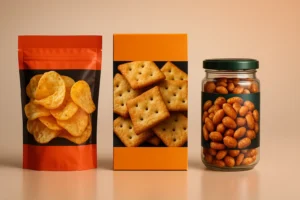
4) Structure Before Surface: Formats, Barriers, Closures
Formats
-
Flexible: stand-up pouches, flow wraps (snacks, coffee). Big billboard, low freight.
-
Rigid: jars/tubs/tins (premium, stackable); watch weight/breakage.
-
Cartons & sleeves: story area; pair with inner film/tray for hygiene.
-
Multipacks: outer impact + inner convenience (portion cues, easy-open).
Barriers
-
Laminates (OPP/PET/PE): tune OTR/WVTR to your product.
-
Paperboard/Kraft: add grease-resistant liners for oily items.
-
Glass/Metal: max barrier; consider transport.
-
MAP/Vacuum: for perishables; design headspace visuals.
Closures & Seals
Zippers, tear-notches, tamper bands—design the first-open moment into the experience.
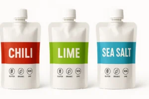
5) Visual System: The 5-Second Read
Front order:
-
Brand mark
-
Variant/Flavor (largest text)
-
Primary benefit (“Air-Fried • 40% Less Oil”)
-
2–3 proof icons (non-GMO, halal, vegan, gluten-free)
-
Net weight
Type pairing: one hero display + one legible text family.
Color logic: assign flavor colors (Chili=red, Lime=green, Sea Salt=blue); lock across packs & web.
Imagery: appetite macros or consistent photoreal 3D renders; standardize your hero angle.
6) Compliance & Labeling (Without Last-Minute Tetris)
-
Nutrition Facts & ingredients per market standard.
-
Allergens: bolded “Contains:” or icon cluster.
-
Storage/Use: “Keep refrigerated,” “Consume within 3 days,” etc.
-
Barcodes/Batch/Lot with quiet zones intact.
-
Certs (organic/halal/kosher/vegan) only if earned.
-
Translations: dedicated panel or QR overflow.
Keep a locked Compliance Layer aligned to your dieline so production tweaks don’t shift legal text.
7) Print Methods, Finishes & Cost Controls
-
Digital – pilots/short runs/seasonals.
-
Flexo – CPG scale, great unit economics.
-
Gravure – massive runs, tight color.
Finishes: matte (modern), soft-touch (premium), spot UV/foil (sparingly on logo/claims).
Save smart: one base pouch + variant labels; limit plate count; right-size to reduce freight.
8) E-commerce Readiness (Thumbnail → Unboxing)
-
Front = poster. Design at 120×120 px first.
-
PDP gallery: front hero, angled back (nutrition/allergens), lifestyle, in-hand scale, short unboxing GIF.
-
Proof bullets: three short claims near the first image.
-
3D first: renders create consistent angles/lighting; swap hero to photos after production.
9) Sustainability (Real, Not Green-washing)
-
Right-size your pack; reduce void and inks.
-
Prefer mono-materials for easier recycling streams.
-
Be specific about end-of-life (“recycle where facilities exist”).
-
Test finishes on actual stock; some foils/laminates hinder recyclability.
10) Process That Actually Ships (Step-by-Step)
-
Discovery & Brief (positioning, claims, channels, unit economics).
-
Shelf Audit (3–5 competitors; what to respect vs. break).
-
Structure Lock (dielines/materials/closures/compliance zones).
-
Concept Territories (2–3) stress-tested at thumbnail size.
-
Refinement + Compliance (nutrition, allergens, barcodes, translations, certs).
-
Prepress Setup (CMYK/spot, trapping, overprint, barcode scale; proofs).
-
Production & QA (vendor liaison, first-article approval).
-
Launch Assets (3D renders, lifestyle frames, PDP kit, unboxing GIF).
11) Common Mistakes & Fast Fixes
-
Everything screams on front. → Enforce hierarchy; move story to side/back.
-
Grease bleed on kraft. → Specify grease-resistant liners or change stock.
-
Barcode failure at checkout. → 100% black on white; correct quiet zone; test at print scale.
-
Variant chaos. → Lock color bands + icon grid + naming rules.
-
Thumbnail mush. → Larger variant, fewer words, higher contrast.
12) FAQs
Q1. How many companies should I shortlist?
Two or three. Run a structured interview and, if possible, a mini paid pilot to compare process and file hygiene.Q2. Local vs. remote—does “near me” matter?
Proximity helps for samples/press checks, but category specialization and strong 3D/PDP workflows often beat location.Q3. Who owns the source files?
Clarify in the contract. You should own print-ready PDFs + layered source files after final payment.Q4. Will the firm manage printers and proofs?
The best ones do: color management, proofs, barcode tests, and first-article approvals.Q5. How long does it take?
Most engagements land in 3–8 weeks depending on SKUs, finishes, compliance, and vendor lead times.Q6. What should the final handoff include?
Press-ready PDFs on final dielines (1:1), outlined fonts, embedded images, CMYK/spot profiles, barcode scaled correctly, a locked Compliance Layer, 3D renders/PNGs, and a PDP image kit.Q7. How do I keep variants consistent at scale?
A style guide (colors, icons, grids, claim zones) + templates + a locked compliance layer.
Hire a Partner That Ships Results
Want strategy → structure → prepress → launch assets handled by one team? Start here: