Design Packaging for Food: A Practical, 2025-Ready Guide
Food packaging isn’t just a wrapper—it’s a sales tool, a safety system, and a brand experience. This guide shows you how to design packaging for food that wins in grocery aisles and on 6-inch screens, while staying compliant, cost-smart, and scalable.
What “Design Packaging for Food” Really Means
Before you open Illustrator, align three pillars:
-
Product & Shelf Life: dry snack vs. oily chips vs. frozen entrée = different barrier needs (moisture/oxygen/grease/UV).
-
Channel: retail shelf, quick commerce, or DTC shipping—each changes structure, unboxing, and photography.
-
Brand System: consistent color logic, typography, iconography, and claims so new flavors don’t break the line.
Internal inspiration: See this quick candy example for structure + color banding: KickBallz candy packaging case study →
Choose the Right Structure (Function First)
-
Flexible (pouches, flow wraps): great for snacks, coffee, pet treats; low shipping volume; add hang-holes for peg displays.
-
Rigid (jars, tubs, tins): premium cues, better stackability; watch weight and breakage.
-
Cartons & Sleeves: storytelling area + tamper integrity; pair with inner films or trays for hygiene.
-
Multipacks: design for outer impact + inner convenience (easy open, portion cues).
Shelf demo test: mock up 3 competitor facings and confirm you’re legible from 1–2 meters and at 120×120 px (thumbnail test).
Materials & Barriers (Safety + Freshness)
-
Paper/Kraft (with liners): sustainable feel; add grease barriers for oily foods.
-
OPP/CPP/PET laminates: common for snacks; tune oxygen/water vapor transmission rate (OTR/WVTR).
-
PE/HDPE: frozen and squeeze-friendly.
-
Glass & Metal: high barrier; premium perception; check weight & transport costs.
-
MAP/Vacuum: for perishables; remember headspace visuals for photography.
-
Seals & Closures: zippers, tear notches, tamper bands—design the “first open” moment.
Tip: Request vendor data sheets for barrier specs and print on the exact stock you’ll use in production.
Visual System: Win the 5-Second Glance
Hierarchy template (front):
-
Brand mark
-
Product name/variant (largest)
-
Primary benefit (e.g., “Air-Fried • 40% Less Oil”)
-
Proof icons (non-GMO, gluten-free, halal, etc.)
-
Net weight
Type & color: One display face + one text family. Assign variant colors by flavor profile (e.g., Chili=red, Lime=green, Sea Salt=blue) and keep them consistent across packs, PDPs, and ads.
Imagery: Use appetite-appeal macro shots or clean 3D renders. Keep a consistent hero angle for line architecture.
Labeling & Compliance (Plan Early, Not Late)
-
Nutrition panel & ingredients: follow your market’s standard (FDA/EFSA/etc.).
-
Allergens: bold or separate “Contains” line.
-
Storage/Use: “Keep refrigerated,” “Best before,” “Once opened, consume within 3 days.”
-
Origin & Codes: batch/lot, barcode, country of origin.
-
Certifications: organic, halal/kosher, vegan—only if you’ve earned them.
-
Translations: if selling across regions, allocate a multi-language panel space now.
Pro move: Create a Compliance Layer in your design file that never moves relative to the dieline.
Printing & Finishes (Premium, Without Waste)
-
Print methods: flexo (high volume), digital (short runs/rapid test), gravure (ultra-consistent for huge runs).
-
Finishes: matte (modern), soft-touch (tactile premium), spot UV/foil (sparingly for claims or logo).
-
Smart savings: one base pouch + variant labels for flavors; or one carton with a window for product visibility.
E-commerce Readiness (Design for Thumbnails)
-
Front panel = poster. Large variant name + recognizable color band = faster clicks.
-
Image set: hero front, angled back (nutrition, allergens), lifestyle (in-use), in-hand for scale, and a short unboxing GIF.
-
Copy snippets: three proof bullets near the first image (“Baked • Whole Grain • No Artificial Flavors”).
Sustainability That’s Real (Not Green-washing)
-
Right-size and reduce void; choose mono-materials where possible.
-
Ink discipline: fewer plates/colors = cost + footprint savings.
-
End-of-life clarity: add “recycle where facilities exist” or disposal icons; avoid ambiguous claims.
Workflow That Ships on Time
-
Brief & moodboard → competitors, tone words, claims.
-
Structure & dieline lock → confirm stock & barrier.
-
2–3 concepts → quick user/retailer feedback.
-
Compliance pass → nutrition, allergens, certifications.
-
Prepress → barcodes, trapping, overprint, color profiles.
-
Press/first article check → adjust to actual stock/ink.
-
Asset kit → print-ready PDFs, layered source files, 3D renders, web crops.
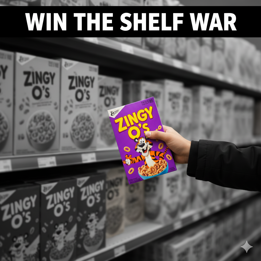
Mini Case Snapshot (Snack Pouch)
A spicy-lime chip brand cut front-panel clutter by 40%, enlarged flavor name, added 3 proof icons, and standardized variant colors. Result: clearer thumbnails, fewer “what flavor is this?” chats, and higher PDP CTR.
See how a playful food category uses bold color + simple iconography here: KickBallz candy packaging.
Common Pitfalls (and Fast Fixes)
-
Everything’s shouting. Fix: strict hierarchy + grid; move story to side/back.
-
Grease bleed on kraft. Fix: specify grease-resistant liners or switch stock.
-
Barcode fails at checkout. Fix: 100% black on white, quiet zone intact, print at production scale.
-
Variant chaos. Fix: lock a color band, icon set, and flavor naming convention.
FAQs
Q1. What’s the best material for oily snacks?
Use laminates with grease and oxygen barriers (e.g., metallized films/OPP laminates) or lined paper; test shelf life with your co-packer.Q2. How big should flavor names be?
Make the variant the largest text after the brand, so it’s legible at 120×120 px thumbnails.Q3. Do I need halal/kosher/vegan icons?
Only if certified. If your buyers care, icons boost trust—but misuse backfires.Q4. How do I handle multi-language packs?
Plan a dedicated panel or use QR for extended info; never cram tiny text across the front.Q5. Digital vs. flexo printing?
Digital for short runs/tests/seasonals; flexo for scale and lower unit cost once volumes rise.Q6. What files do printers need?
Print-ready PDFs on the final dieline, outlined fonts, embedded images, CMYK/spot colors, barcode at real size, plus linked nutrition artwork.