Mastering Bottle Packaging Design: Where Shape, Safety, and Strategy Meet
Table of Contents
- Introduction: The Bottle—Your Brand’s Sculpted Salesman
- Structural Psychology: How Shape Sells Your Product
- The Material Chakar: Glass vs. Plastic vs. Metal
- Technical Safety: Preserving Contents and Preventing Leaks
- Functionality First: Dispensing and User Experience
- Branding Elements: Typography, Color, and Tactile Finishes
- The Compliance Mandate: Labeling and Tamper Evidence
- The Power of Custom Molding for Differentiation
- Frequently Asked Questions (FAQs)
- The Bottle Design Scorecard
- Conclusion: A Design That’s Built to Last
Introduction: The Bottle—Your Brand’s Sculpted Salesman
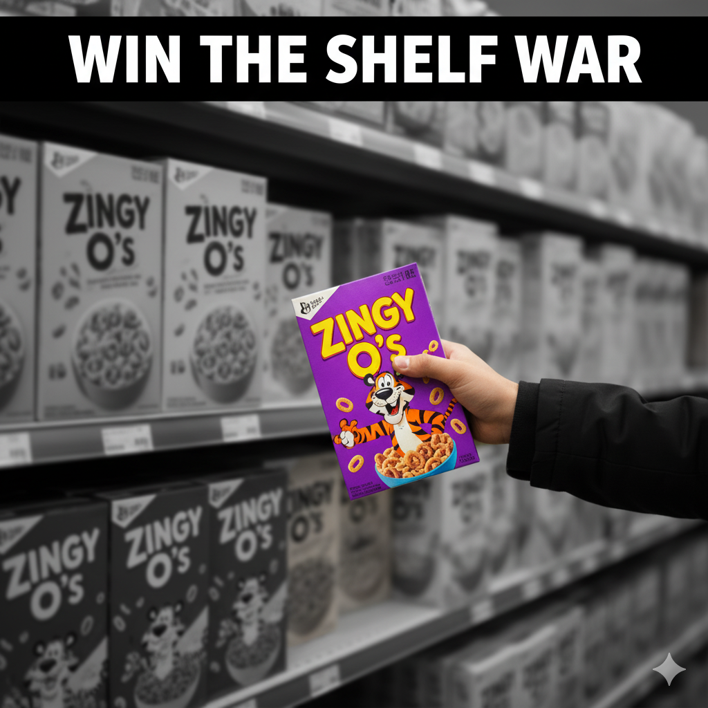
In the FMCG, beverage, and cosmetics sectors, the design packaging bottle is the product’s very identity. Unlike flat packaging, a bottle is a three-dimensional marketing tool that influences consumer choice through sight, touch, and sound (the satisfying “clink” of glass, the precise “click” of a cap). A successful bottle design must perform two critical tasks: securely contain and preserve the liquid product, and immediately communicate the brand’s value and purpose. Getting this structural design right is key to surviving the shelf war and building instant brand recognition.
Structural Psychology: How Shape Sells Your Product
The shape of a bottle is one of the most influential factors in consumer perception, often trumping the label design itself. This is structural psychology, yaar:
| Bottle Shape | Consumer Perception | Best For |
| Tall & Slender | Elegance, premium quality, sophistication. | Luxury spirits, perfumes, high-end serums. |
| Rounded/Curved | Approachability, softness, tradition. | Food preserves, family sauces, natural products. |
| Squared/Geometric | Masculine, modern, efficiency, sturdiness. | Car care liquids, modern beverages, men’s grooming. |
| Hefty/Dense | Durability, superior quality (heavier weight = higher value). | Premium juices, wine, high-end cosmetic creams. |
Designing a unique silhouette (like the iconic Coca-Cola or Absolut Vodka bottles) is the fastest way to achieve brand differentiation that competitors cannot easily copy.
The Material Chakar: Glass vs. Plastic vs. Metal
The material choice is crucial, as it affects cost, safety, and product longevity:
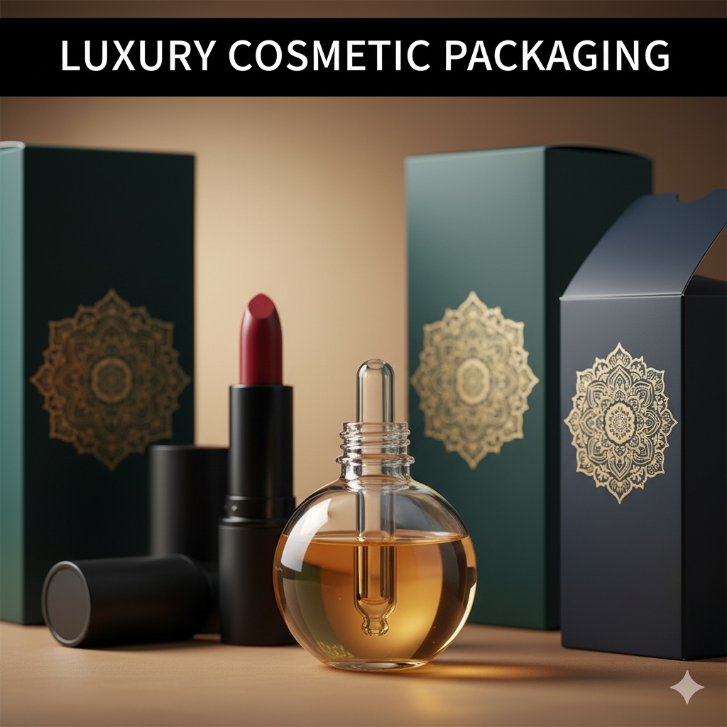
- Glass: Conveys luxury, purity, and trust due to its non-reactive and non-porous nature. It is ideal for sensitive products (perfumes, fine wines) and for brands emphasizing sustainability (high recyclability). However, it is heavier and more expensive.
- Plastic (PET/HDPE): Lightweight and versatile, making it highly cost-effective and lowering transportation costs. It’s dominant for juices, cleaners, and oils, but requires careful selection to ensure chemical compatibility and avoid absorption.
- Metal (Aluminum/Tin): Used for carbonated drinks and aerosols due to its durability and excellent barrier properties.
Technical Safety: Preserving Contents and Preventing Leaks
For liquids, functionality is non-negotiable. Poor design leads to spoilage or leakage, ruining inventory.
- Barrier Protection: The bottle material must provide an adequate barrier against external elements like oxygen, UV light, and moisture. Amber or opaque glass/plastic is often used for light-sensitive ingredients.
- Sealing Integrity: The cap torque (tightness) and closure mechanism (screw cap, pump, dropper) must be precisely engineered to prevent leakage and maintain an airtight seal.
- Aseptic Packaging: For perishable goods (like milk or juice), special filling processes and container design are needed to ensure the liquid is sealed in a sterile environment to preserve freshness.
Functionality First: Dispensing and User Experience
A bottle must be ergonomic and easy to use. The design should enhance the experience of pouring, gripping, and storing:
- Ergonomics: Designing the 3D bottle shape with grooves, textures, or specific neck curvature improves grip and pouring ease, especially when the bottle is wet or oily.
- Precision: Incorporating advanced dispensing mechanisms (airless pumps, calibrated droppers, spouted pouches) allows for precise, waste-free use of high-value products like serums and medicines.
- Resealability: Features like a screw-top cap or a flip-top closure maintain product quality after the initial use and add convenience for the consumer.
Branding Elements: Typography, Color, and Tactile Finishes
The label and decoration tie the structural form to the brand identity:
- Color Psychology: Use color on the label to evoke the right emotion (Red for energy, Black for sophistication). The color of the liquid itself should complement the material (e.g., clear glass showing purity).
- Tactile Finishes: Techniques like embossing/debossing (raised or recessed logos directly on the glass/plastic), frosted finishes (for a silky, premium feel), or metallic foiling on the label create a sensory impact that makes the bottle memorable.
- Information Hierarchy: The design must position the brand name clearly at the top of the visual search pattern, followed by the product type and key benefits.
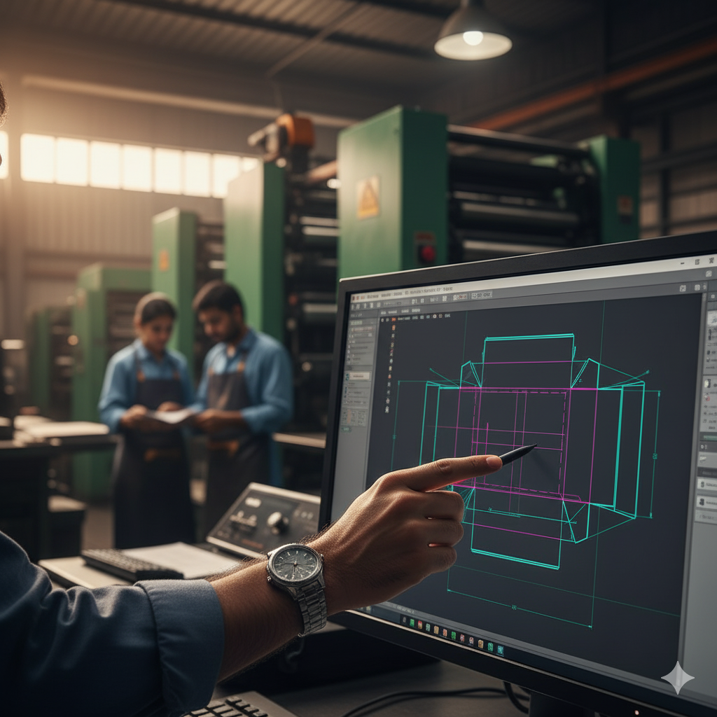
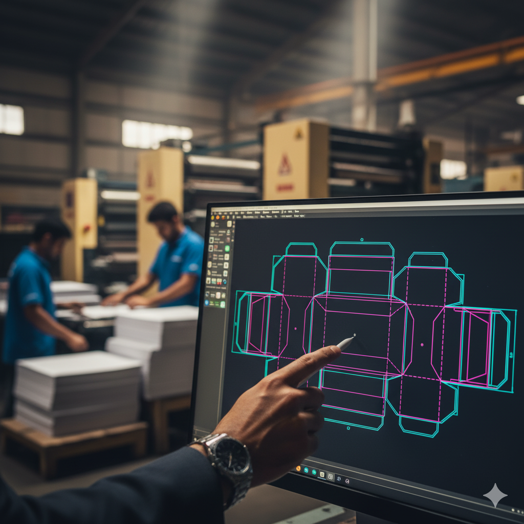
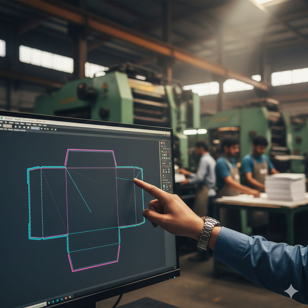
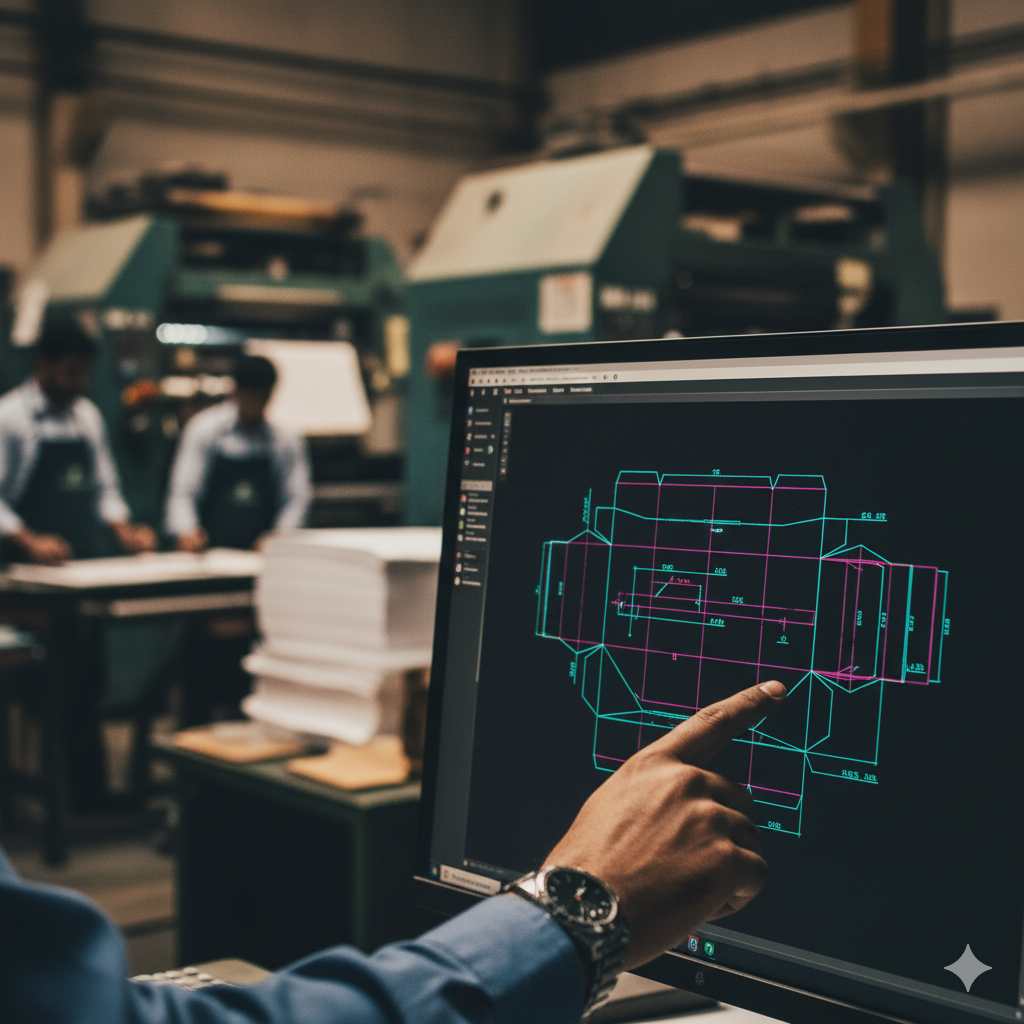
Portfolio Showcase: Packaging Design Excellence
See how our strategic designs create unique market positions and measurable impact for our clients: