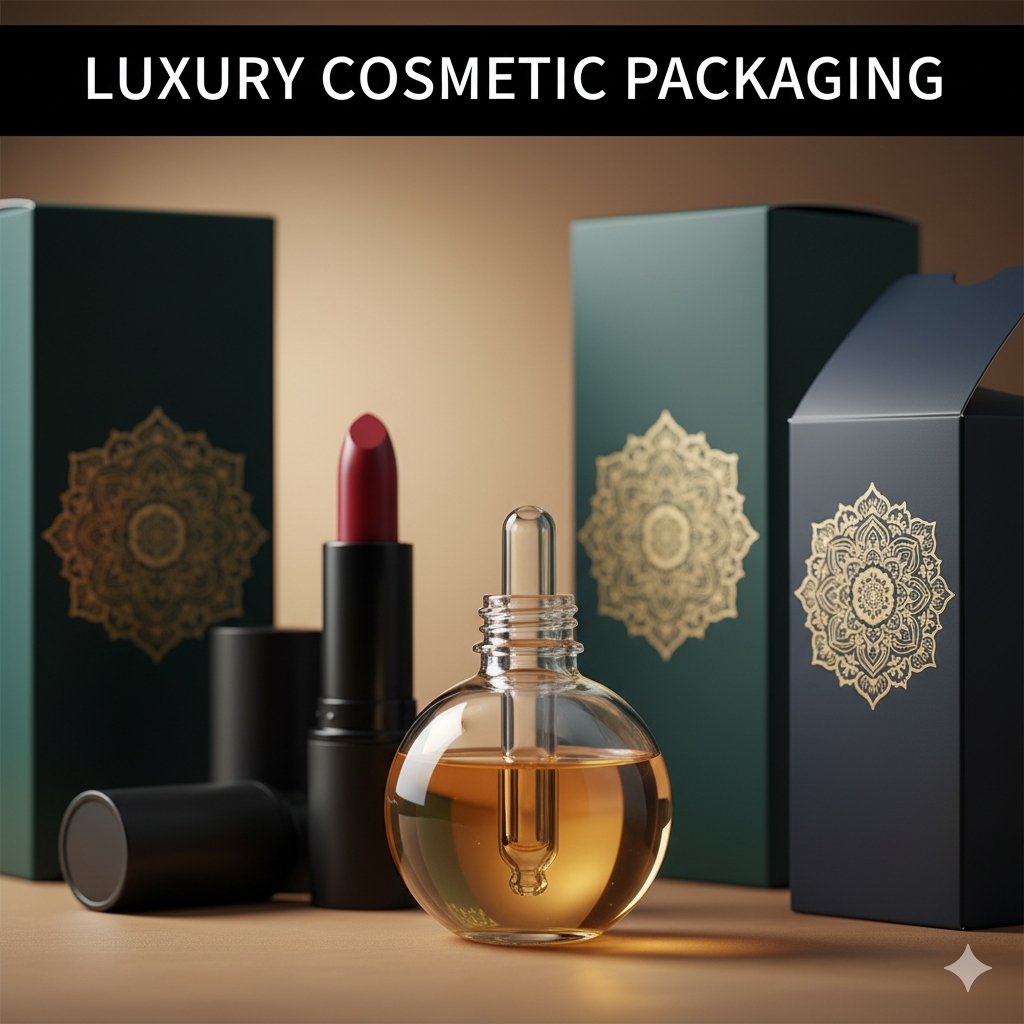
Design in Packaging: How Form, Function & Story Drive Sales
Design in packaging isn’t decoration—it’s how your product speaks, protects, sells, and scales. This guide breaks down the strategy, structure, visuals, compliance, and sustainability moves that make packaging win on shelf and on a 6-inch phone screen.
Table of Contents
-
What “Design in ” Actually Covers
-
Strategy First: Market, Audience, and Claims
-
Structure Before Surface: Dielines, Materials, Barriers
-
Visual System: The 5-Second Read
-
Information Architecture & Compliance
-
Print & Finishes (Without Burning Budget)
-
E-commerce Readiness: Thumbnails to Unboxing
-
Sustainability that’s Real (Not Green-washing)
-
Workflow You Can Actually Ship
-
Common Mistakes & Fast Fixes
-
Image Prompts (for Blog/Thumbnails)
-
FAQs
-
Rank Math Data (Copy-Paste)
1) What “Design in Packaging” Actually Covers
“Design in packaging” is the crosspoint of structure + graphics + compliance. Done right, it:
-
Clarifies who it’s for and why it’s better.
-
Protects shelf life and reduces returns/damage.
-
Produces thumbnail-legible visuals for e-commerce.
-
Scales to new flavors/variants without re-inventing.
-
Stays compliant in every market you sell.
See a clean structural + color system applied to a food brand: Sushi Packaging Design (case sample) →
2) Strategy First: Market, Audience, and Claims
Before Illustrator, align:
-
Positioning: Price, purity, performance, or personality?
-
Category Codes: Learn them—then bend them (skincare ≠ snacks ≠ supplements).
-
Primary Promise: A short, benefit-led headline repeatable by your customer.
-
Proof: 2–3 verifiable claims (e.g., “Sugar-free,” “Clinically tested,” “Halal”).
-
Channel Mix: Shelf retail vs. DTC vs. Q-commerce impacts structure and visuals.

3) Structure Before Surface: Dielines, Materials, Barriers
Structure drives cost, protection, and unboxing.
Dielines & Formats
-
Pouches/flow wraps: High billboard, low freight.
-
Cartons/sleeves: Story area, tamper integrity; pair with trays/wraps.
-
Rigid (tubes/jars): Premium cues, stackability; watch weight.
-
Multipacks: Design outer impact + inner convenience (easy-open cues).
Materials & Barriers
-
Paper/Kraft (with liners) for natural feel.
-
Laminates (OPP/PET/PE) tuned for OTR/WVTR (oxygen/moisture).
-
Glass/Metal for max barrier & premium; consider transport cost.
-
MAP/Vacuum for perishables; design headspace visuals.
Closures & Seals
Zippers, tear-notches, tamper bands—design the first-open moment into the experience.
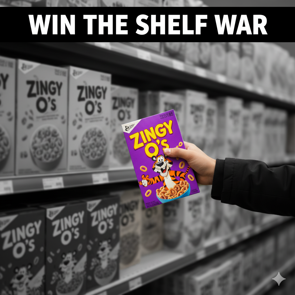
4) Visual System: The 5-Second Read
Use strict hierarchy to win at a glance and in thumbnails:
-
Brand mark (recognition)
-
Product/Variant name (largest text)
-
Primary promise (e.g., “Air-Fried • 40% Less Oil”)
-
Proof icons (non-GMO, halal, vegan, sugar-free)
-
Net weight (mandated)
Typography: One hero display face + one highly legible text family.
Color logic: Assign functional colors per variant (Chili=red, Lime=green, Calm=lavender).
Imagery: Appetite appeal/macros for food; clean 3D renders for supplements/cosmetics.
Grid: Modular layouts so new SKUs snap into place.
Supplement example with bold benefit-first layout:
Dog Supplement Label Design →
Frequent supplement work:
Supplement Label Design Freelancer →
5) Information Architecture & Compliance
Plan compliance early (don’t resize at the last minute).
-
Nutrition/INCI panels & ingredients per market standard.
-
Allergens: bolded “Contains:” line or icon cluster.
-
Storage/Use: “Keep refrigerated,” “Consume within 3 days,” etc.
-
Barcodes/Batch/Lot with clear quiet zones.
-
Certs: Only if certified (organic, halal/kosher, vegan).
-
Translations: Allocate a multi-language panel or use a QR for overflow content.
Pro tip: keep a locked Compliance Layer aligned to the dieline.
6) Print & Finishes (Without Burning Budget)
-
Print Methods:
-
Digital for pilots/short runs/seasonals.
-
Flexo for scale (snacks/CPG).
-
Gravure for massive volume consistency.
-
-
Finishes:
-
Matte (modern clarity)
-
Soft-touch (tactile premium)
-
Spot UV/foil (sparingly for claims/logo)
-
-
Smart Savings: One base box + versioned stickers; one pouch + variant labels.
7) E-commerce Readiness: Thumbnails to Unboxing
-
Front panel = poster. Big brand, bigger variant, clear color band.
-
Image set: front hero, angled back (nutrition), lifestyle, in-hand scale, and a short unboxing GIF.
-
PDP proof bullets: 3 short claims near the first image.
-
Consistency: same camera angle/lighting across the line boosts trust.
High-contrast variant system for attention:
Vape Packaging Design Store (portfolio) →
8) Sustainability that’s Real (Not Green-washing)
-
Right-size the pack; reduce void and secondary wraps.
-
Prefer mono-materials for easier recycling streams.
-
Trim ink plates; limit metallics unless they truly add value.
-
Communicate end-of-life (recycle icon, “where facilities exist,” disposal guidance).
9) Workflow You Can Actually Ship
-
Brief & moodboard (competitors, tone, claims).
-
Structure & dieline lock (printer specs, barrier data sheets).
-
2–3 concepts → quick user/retailer feedback.
-
Compliance pass (nutrition/INCI, allergens, certs, barcodes).
-
Prepress (CMYK/spot, trapping, overprint, barcode scaling).
-
Press/first article check (adjust to real stock/ink).
-
Asset kit (print-ready PDFs, layered source, 3D renders, web crops).
10) Common Mistakes & Fast Fixes
-
Everything screams on front. Fix: ruthless hierarchy; move story to side/back.
-
Variant chaos. Fix: fixed color bands + icon set + naming logic.
-
Grease bleed on kraft. Fix: specify grease-resistant liner or change stock.
-
Barcode failures. Fix: 100% black, proper quiet zone, test at production scale.
-
Thumbnail mush. Fix: larger variant name + fewer words + higher contrast.
-
12) FAQs
Q1. What’s the core difference between “packaging design” and “design in packaging”?
“Packaging design” often implies the full process. “Design in packaging” emphasizes how design decisions (structure + graphics + info) impact function, sales, and sustainability.Q2. Which comes first—structure or graphics?
Always structure. Lock dielines, materials, and closures before polishing the visuals.Q3. How big should the variant name be?
Usually the largest text after the brand—test readability at 120×120 px.Q4. Digital or flexo printing?
Digital for tests/short runs; flexo for scale and lower unit cost; gravure for very large runs with color consistency.Q5. Do I need certifications on front?
Only if they matter to buyers and you’re certified. Misuse damages trust.Q6. What files do manufacturers need?
Print-ready PDFs on the final dieline, outlined fonts, embedded images, CMYK/spot colors, correct barcode size, and compliance panels.Q7. How do I make my packaging more sustainable without cost blow-ups?
Right-size, reduce inks, prefer mono-materials, and design for existing recycling streams.
Hire the Designer
Need a packaging system that sells on shelf and on a phone screen? Let’s build it.
-
Portfolio food example: Sushi Packaging Design →
-
Supplements work: Dog Supplement Label Design →
-
High-impact variants: Vape Packaging Design Store →
-