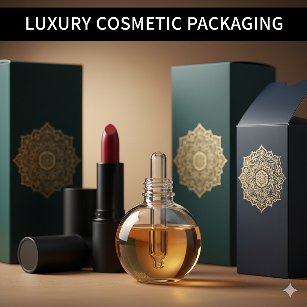
Branding and Packaging Design: Turn Your Product into a Repeatable, Recognizable System
Great branding without packaging execution is a pitch deck. Great packaging without brand strategy is decoration. Branding and packaging design—together—turn your promise into a physical and digital system that people recognize in seconds, trust instinctively, and buy repeatedly. This 2025-ready guide walks you through strategy, structure, visuals, compliance, sustainability, and e-commerce assets so your next launch looks premium and performs—on shelf and on a 6-inch screen.
Table of Contents
-
Why “Branding and Packaging Design” Belongs Together
-
Brand Strategy First (Promise → Proof → Personality)
-
Structure Before Surface (Dielines, Materials, Barriers)
-
Visual System (Type, Color, Imagery, Iconography, Grid)
-
Information Architecture & Compliance (Readable and Legal)
-
E-commerce Readiness (Thumbnail to Unboxing)
-
Sustainability That’s Real (Not Green-washing)
-
Extensions & Scalability (Variants, Bundles, Retailer Packs)
-
Mini Case Snapshots (Portfolio)
-
Common Mistakes & Fast Fixes
-
Image Prompts (Hero, System Board, Before/After, Dieline)
-
FAQs
-
Rank Math Data (Copy-Paste)
1) Why “Branding and Packaging Design” Belongs Together
-
Branding defines the story, voice, and recognition system (logo, type, color, icons, tone).
-
Packaging design translates that system to a protective, compliant, sales-driven canvas across formats (pouches, cartons, jars, tubes) and channels (retail, DTC, q-commerce).
Aligned, they create a scalable identity—each new flavor/size plugs into the same rules and still looks unmistakably you.
Food example with structure + bold color logic: Sushi Packaging Design
2) Brand Strategy First (Promise → Proof → Personality)
-
Positioning: Premium, clinical, playful, clean, performance? Pick one and stick to it.
-
Primary Promise: A short, repeatable headline customers can quote back.
-
Proofs (2–3): Verifiable claims (e.g., “No Added Sugar”, “Halal”, “Dermatologist Tested”).
-
Voice: Minimal luxury vs. bold fun; set copy length, humor level, and do/don’t words.
-
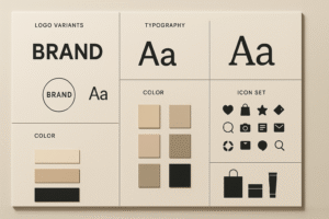
Recognition Assets: Logo variants, wordmark/monogram, color swatches, icon set, photo/3D style.
Output: a concise Brand System Guide designers and printers can actually use.
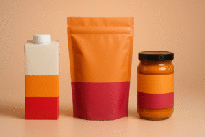
3) Structure Before Surface (Dielines, Materials, Barriers)
Structure drives cost, protection, and unboxing joy.
Formats
-
Pouches/flow wraps: Big billboard, low freight; add hang holes for pegs.
-
Cartons/sleeves: Story space + tamper integrity; pair with trays/liners.
-
Jars/tins/tubes: Premium cues, stackability; mind weight and breakage.
-
Multipacks/bundles: Design outer impact + inner convenience (easy-open cues).
Materials & Barriers
-
Paperboard/Kraft (add grease liners if oily).
-
Laminates (OPP/PET/PE) tuned for OTR/WVTR (oxygen/moisture).
-
Glass/Metal for high barrier; adjust freight expectations.
-
MAP/Vacuum for perishables; design headspace visuals.
Closures & Seals
Zippers, tear notches, tamper bands—design the first-open moment into the experience.
4) Visual System (Type, Color, Imagery, Iconography, Grid)
Turn strategy into a 5-second read that wins at thumbnail size.
Hierarchy (front panel):
-
Brand mark
-
Product/Variant (largest text)
-
Primary promise (benefit)
-
2–3 proof icons (non-GMO, halal, vegan, etc.)
-
Net weight
Type pairing: One hero display face + one workhorse text family.
Color logic: Assign variant colors (Chili=red, Mint=teal, Calm=lavender) and keep them consistent across packs, PDPs, ads.
Imagery: Appetite macros for food; consistent photoreal 3D renders for supplements/cosmetics to unify the line.
Icon set: 6–12 icons with size rules—don’t improvise per SKU.
Grid: Modular layouts so extensions don’t break the system.
Supplements with benefit-first hierarchy:
Dog Supplement Label Design
More supplement work:
Supplement Label Design Freelancer
5) Information Architecture & Compliance (Readable and Legal)
Plan compliance early—don’t Tetris it later.
-
Nutrition/INCI, ingredients, allergens (with bold “Contains” line where required).
-
Storage/use (“Keep refrigerated,” “Consume within 3 days”).
-
Barcodes/Batch/Lot with quiet zones intact.
-
Certs (organic/halal/kosher/vegan) only if earned.
-
Translations: dedicate a multi-language panel or use a QR for overflow.
Keep a locked Compliance Layer aligned to the dieline in your source files.
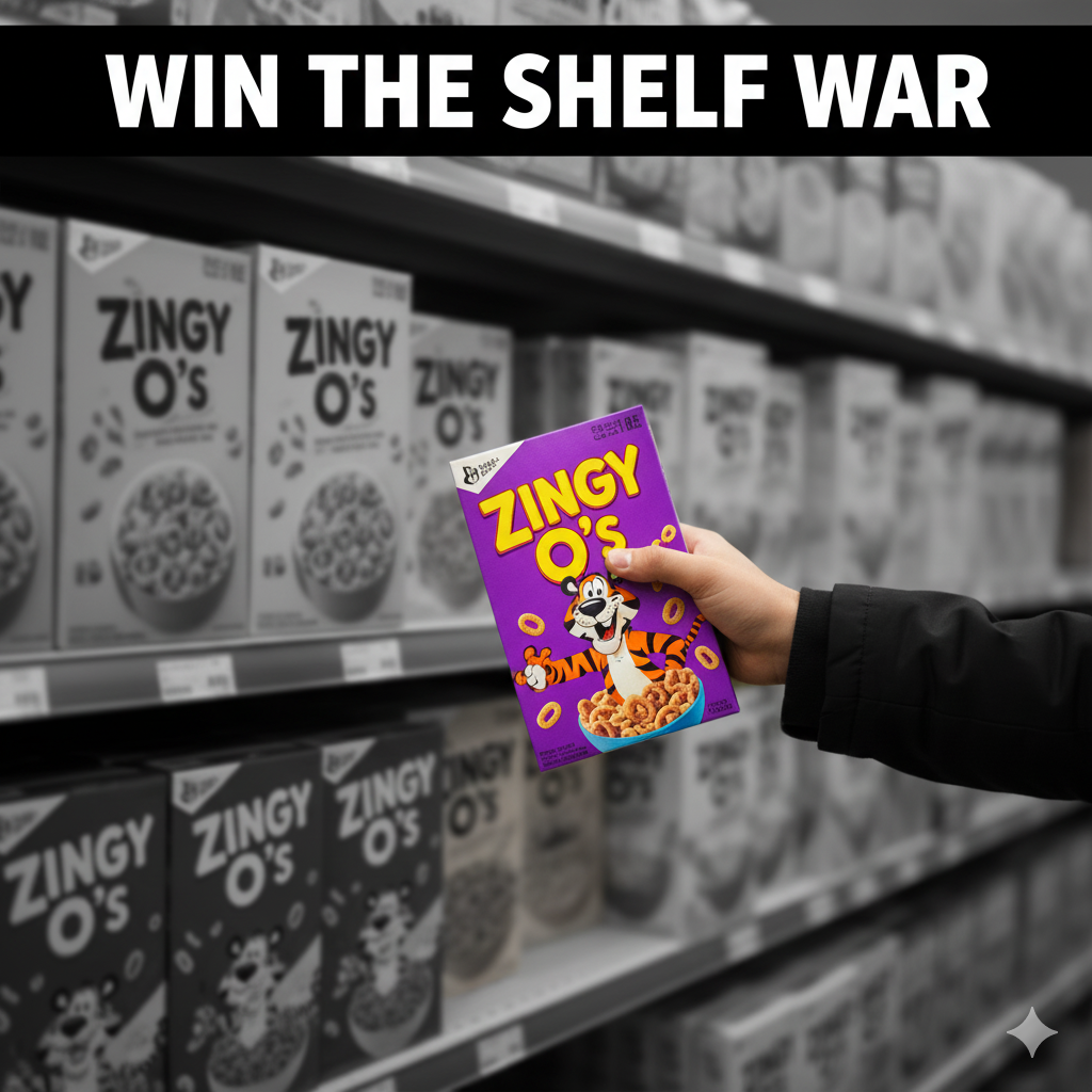
6) E-commerce Readiness (Thumbnail to Unboxing)
-
Front panel = poster. Big variant name + color band improve scroll-stop and CTR.
-
PDP gallery: front hero, angled back (compliance), lifestyle, in-hand scale, short unboxing GIF.
-
Copy snippets: three proof bullets near the first image.
-
Consistency: same camera angle/lighting across SKUs = higher trust and repeat buys.
High-contrast variants for attention:
Vape Packaging Design Store
7) Sustainability That’s Real (Not Green-washing)
-
Right-size your pack; reduce void and ink plates.
-
Prefer mono-materials where possible (easier recycling streams).
-
Be specific about end-of-life (“recycle where facilities exist”) and avoid vague claims.
-
Test finishes on actual stock; some foils/laminates affect recyclability.
8) Extensions & Scalability (Variants, Bundles, Retailer Packs)
-
Variant rules: color band, flavor/naming pattern, fixed claim zone, icon grid.
-
Bundles/multipacks: outer pack inherits brand logic with larger billboard zones.
-
Retailer-specific: sticker windows defined in the system (don’t block hero claims).
-
Seasonals/Collabs: change accents/illustrations; keep core layout untouched.
9) Mini Case Snapshots (Portfolio)
-
Food (carton + flow wrap): Reduced front clutter, enlarged variant, standardized color bands → clearer thumbnails, fewer “what flavor?” chats.
See tone: Sushi Packaging Design -
Supplements (jar + label): Benefit headline + 3 trust icons; scaled to 6 SKUs without redesign chaos.
Explore: Dog Supplement Label Design
10) Common Mistakes & Fast Fixes
-
Everything screams on front. → Enforce hierarchy; move story to side/back.
-
Variant chaos. → Lock color bands, icon set, naming logic.
-
Barcode fails. → 100% black on white, proper quiet zone, size test at print scale.
-
Grease bleed on kraft. → Specify grease-resistant liners or switch stock.
-
Thumbnail mush. → Larger variant name, fewer words, higher contrast.
12) FAQs
Q1. What’s the difference between branding, packaging, and “branding and packaging design”?
Branding = who you are; packaging = how that shows up on a product; branding and packaging design = the integrated system that sells and scales.Q2. Which comes first—brand or pack?
Do a light brand system (logo/type/colors/voice) first, then lock structure and design the pack. For speed, develop in parallel with strict roles.Q3. How big should the variant name be?
Typically the largest text after the brand; must read at 120×120 px.Q4. Digital vs. flexo vs. gravure?
Digital for pilots/short runs; flexo for efficient scale; gravure for very high volumes and tight color.Q5. Should I put certifications on the front?
Only if earned and relevant to buyers; misuse damages trust.Q6. What will my printer need?
Press-ready PDFs on final dielines (1:1), outlined fonts, embedded images, CMYK/spot profiles, correct barcode size, locked compliance panels.Q7. How do I keep a growing line consistent?
A style guide + locked compliance layer + template grid + fixed icon sizes and color rules.
Hire Us to Align Brand + Pack (and Ship)
Need a system that looks premium and performs—on shelf and online? Let’s build it.
-
Food example: Sushi Packaging Design
-
Supplements: Dog Supplement Label Design
-
High-impact variants: Vape Packaging Design Store
-