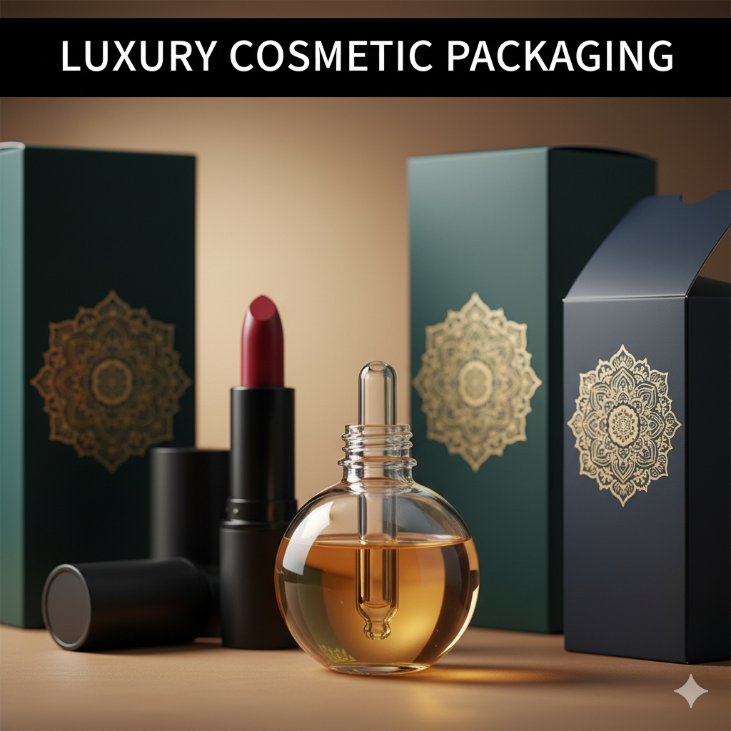
Branding and Packaging: Build a System that Sells on Shelf and on a 6-Inch Screen
Great packaging without brand strategy is decoration. Great branding without packaging execution is a pitch deck. Branding and packaging together create the system that makes your product recognizable, trustworthy, and repeatable—across SKUs, seasons, and stores (physical and digital). This guide shows how to align story → structure → visuals → prepress so your line looks premium and performs.
Table of Contents
-
What “Branding and Packaging” Really Means
-
Brand Strategy First (Promise, Proof, Personality)
-
Structure Before Surface (Dielines, Materials, Barriers)
-
Visual System (Type, Color, Imagery, Grid)
-
Information Architecture & Compliance
-
E-commerce Readiness (Thumbnails to Unboxing)
-
Sustainability Without Green-washing
-
Extensions: Variants, Bundles, Seasonals
-
Mini Case Snapshots (Portfolio)
-
Common Mistakes & Fast Fixes
-
Image Prompts (Hero, System, Before/After, Moodboard)
-
FAQs
-
Rank Math Data (Copy-Paste)
1) What “Branding and Packaging” Really Means
-
Branding defines your promise, voice, and recognition system (logos, type, color, icons, tone).
-
Packaging translates that system to a physical/e-com canvas that must protect, inform, and sell.
Together, branding and packaging create a scalable identity: every new flavor, size, and channel plugs into the same rules and still looks unmistakably “you.”
Food example with structure + bold color logic: Sushi Packaging Design →
2) Brand Strategy First (Promise, Proof, Personality)
-
Positioning: Are you premium, playful, clinical, clean, or performance-led?
-
Primary Promise: A short, repeatable benefit (e.g., “Daily Calm in One Gummy”).
-
Proofs (2–3): Verifiable claims (e.g., “No Added Sugar”, “Halal”, “Dermatologist Tested”).
-
Voice & Personality: Minimal luxury vs. bold fun; set copy length, tone, and emoji/illustration rules.
-
Recognition Assets: Logo variants, wordmark/monogram use, color swatches, icon set.
Output: a Brand System Guide with rules you can hand to any designer or printer.
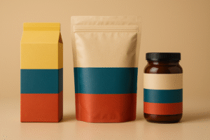
3) Structure Before Surface (Dielines, Materials, Barriers)
A brand that ignores structure will pay for it later.
-
Formats: pouch/flow wrap (billboard, low freight), carton/sleeve (story space), jars/tins (premium cues), tubes/trays (protection, stacking).
-
Materials & Barriers: paperboard/kraft (add grease liner if needed), laminates tuned to OTR/WVTR, glass/metal for high barrier; note freight.
-
Closures: zippers, tear notches, tamper bands—design the “first open” moment.
-
Compliance space: reserve nutrition/INCI/allergen/barcode zones before concept art.
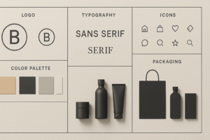
4) Visual System (Type, Color, Imagery, Grid)
This turns strategy into consistent shelf and screen performance.
-
Type Pairing: One hero display face + one legible text family; cap styles and sizes.
-
Color Logic: Assign functional variant colors (Chili=red, Mint=teal, Calm=lavender). Lock them for all SKUs and channels.
-
Imagery: Appetite macros for food, controlled 3D renders for supplements/cosmetics.
-
Iconography: 6–12 icons (halal/vegan/non-GMO/recyclable) with size rules.
-
Grid: A modular layout so new flavors snap in without re-inventing.
Supplements done with benefit-first hierarchy:
Dog Supplement Label Design →
More supplement work & styles:
Supplement Label Design Freelancer →
5) Information Architecture & Compliance
Plan the reading order so customers understand in 5 seconds:
-
Brand mark
-
Product/variant (largest text)
-
Primary promise (big, benefit-led)
-
2–3 proof icons
-
Net weight (and mandatories near the back/side)
Compliance: nutrition/INCI, allergens, storage/use, barcodes, batch/lot, certs (only if earned), translations. Keep a locked Compliance Layer in your source files.
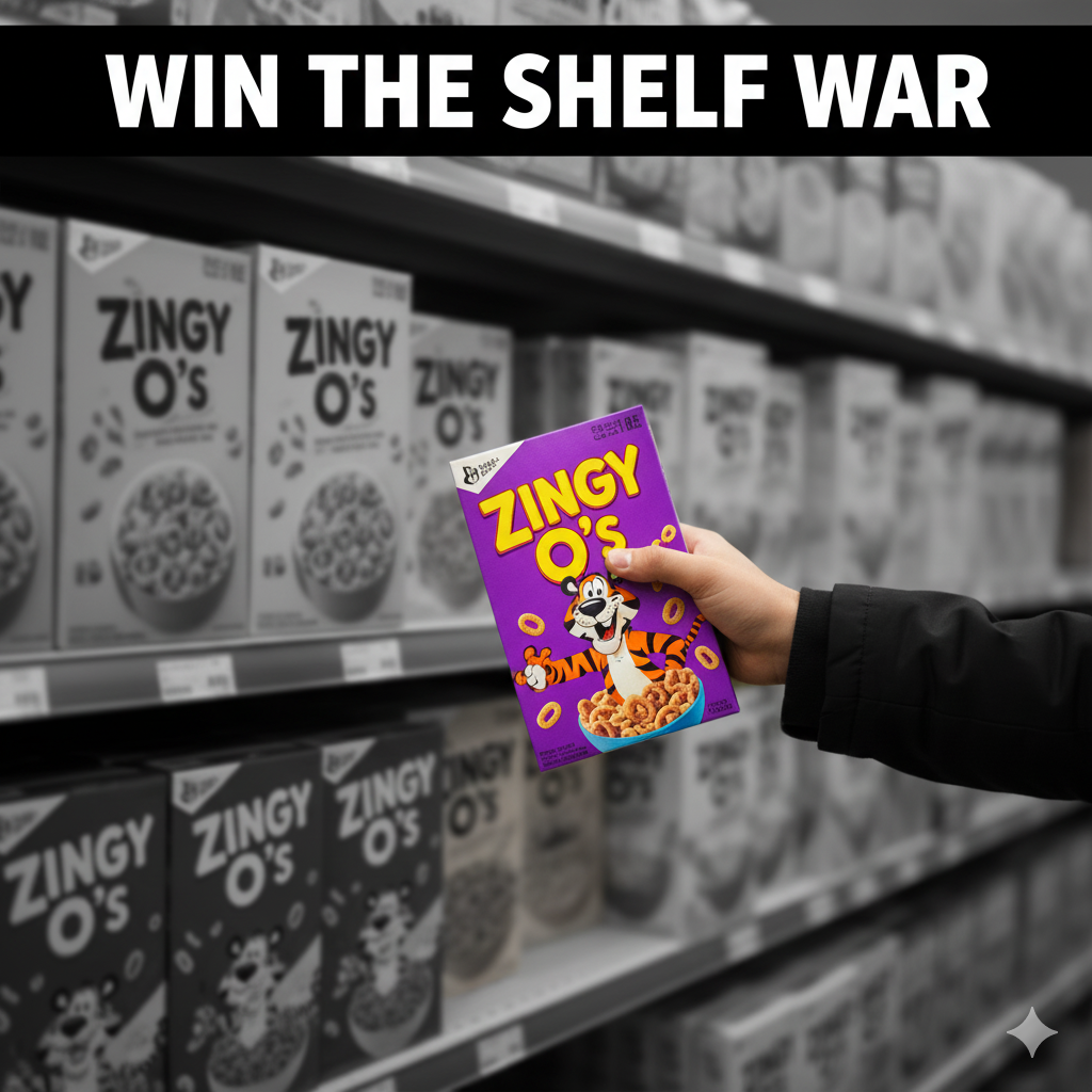
6) E-commerce Readiness (Thumbnails to Unboxing)
-
Front panel = poster that reads at 120×120 px.
-
PDP gallery: hero front, angled back (ingredients/nutrition), lifestyle/in-hand scale, short unboxing GIF.
-
Copy snippets: three proof bullets in the first image pane.
-
3D render pipeline: consistent angles/lighting across SKUs for premium, unified grids.
High-contrast variant system for attention:
Vape Packaging Design Store →
7) Sustainability Without Green-washing
-
Right-size the pack; reduce void and ink plates.
-
Prefer mono-materials where possible for simpler recycling.
-
Be specific about end-of-life (“recycle where facilities exist”).
-
Avoid vague claims—be factual and verifiable.
8) Extensions: Variants, Bundles, Seasonals
-
Variant Rules: color band, flavor naming pattern, icon set placement.
-
Bundles/Multipacks: ensure outer pack inherits brand logic with larger billboard zones.
-
Seasonals/Collabs: maintain core layout; swap accent palette/illustrations only.
9) Mini Case Snapshots (Portfolio)
-
Food (carton + flow wrap): Reduced front clutter, enlarged variant name, standardized color bands → clearer thumbnails, fewer “what flavor?” chats.
See tone: Sushi Packaging Design -
Supplements (jar + label): Benefit headline + 3 proof icons; the line scaled to 6 SKUs without redesign chaos.
Explore: Dog Supplement Label Design
10) Common Mistakes & Fast Fixes
-
Everything screams on front. → Enforce hierarchy; move story to side/back.
-
Variant chaos. → Lock a color system and icon grid.
-
Barcode misreads. → 100% black on white, quiet zone intact, test at print scale.
-
Grease bleed on kraft. → Specify grease-resistant liners or change stock.
-
Thumbnail mush. → Larger variant name, fewer words, higher contrast.
12) FAQs
Q1. What’s the difference between branding and packaging?
Branding defines who you are (promise, voice, recognition). Packaging is how that shows up on a product with structure, compliance, and sales-focused visuals.Q2. Which comes first—brand or packaging?
If you’re new, do a light brand system first (logo, type, colors, voice), then lock structure and design the pack. If you’re shipping fast, build both in parallel with strict roles.Q3. How do I keep a growing line consistent?
Create a style guide: color assignments, icon sizes, claim zones, grid, and photography angles. Use templates and a locked Compliance Layer.Q4. Digital vs. flexo vs. gravure printing?
Digital for pilots/short runs; flexo for efficient scale; gravure for very high volumes and color consistency.Q5. What files do manufacturers need?
Press-ready PDFs on the final dieline, outlined fonts, embedded images, CMYK/spot colors, correct barcode size, plus nutrition/INCI/allergen panels.Q6. Can branding and packaging improve e-commerce results?
Yes—bigger variant names, strong color bands, and consistent hero angles improve thumbnail recognition and CTR.
Hire Us to Align Brand + Pack (and Ship)
Need a system that looks premium and performs—on shelf and online? Let’s build it.
-
Food example: Sushi Packaging Design
-
Supplements: Dog Supplement Label Design
-
High-impact variants: Vape Packaging Design Store
-