Medical Packaging Design
Table of Contents
-
Industry Context: Why 2025 raised the bar
-
Services & Features you need for medical packaging design
-
Scorecard: 12 evaluation points (use before sign-off)
-
Process (strategy → risk → dieline → prepress → print)
-
Visual System & Information Hierarchy for healthcare
-
Compliance & Risk Controls (high-level, non-legal)
-
Print Methods, Materials & Finishes (medical reality)
-
E-commerce & Hospital Readiness (thumbnail → PDP → line use)
-
Sustainability (real impact, zero greenwashing)
-
Common Mistakes & Quick Fixes
-
Files, Color & Prepress (what printers and QA need)
-
Timelines, MOQs & Cost Levers
-
Hire CTA + Internal Portfolio Links
Industry Context: Why 2025 raised the bar
-
UDI and traceability everywhere. Hospitals require scannable GS1/UDI barcodes with proven quiet zones ≥ 2.5 mm, human-readable backups, and durable inks that survive disinfectants.
-
Sterile barrier discipline. Pouches, trays, and cartons must protect sterilized components with tamper cues and intuitive opening; graphics must not interfere with seals or peel paths.
-
Color truth > color drama. LAB-managed Pantones with ΔE ≤ 2.0 are expected across vendors so dose/size tiers stay consistent under clinical lighting.
-
Usability & safety. Large x-heights, plain-language IFUs, and clear iconography reduce med-use errors; thumbnails must still read on e-Procurement portals.
-
Sustainability with sense. Right-weighting and mono-materials—without compromising sterility or barrier properties—are the new baseline.
Services & Features you need for medical packaging design
-
Risk-led architecture: user tasks, critical info mapping, and color-not-alone differentiation for strengths/sizes.
-
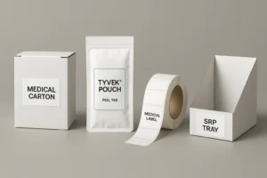
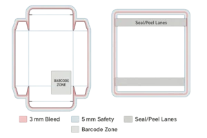
Structural CAD: cartons, labels, pouches (Tyvek®/film), thermoform trays, unit-dose labels, shippers; bleed ≥ 3 mm, safety 3–5 mm; seal/peel/tamper paths called out.
-
Prepress governance: trapping 0.08–0.12 mm, overprint/knockout maps, total ink limits, rich black policy (solids only).
-
Color management: Pantone + LAB targets, ΔE tracking, CMYK simulations under D50 and cool-white hospital lighting.
-
Coding & serialization: UDI/GTIN + lot/expiry windows; quiet zones; print contrast minimums; 2D DataMatrix where applicable.
-
Human factors kit: large x-height, contrast ≥ 4.5:1, tactile cues, open-here chevrons, glove-friendly tabs.
-
Sustainability roadmap: mono-material swaps, caliper optimization, honest disposal guidance (QR to regional info).
Scorecard: 12 evaluation points (use before sign-off)
-
Hierarchy clarity: brand/manufacturer → product → dose/size → route → lot/exp.
-
Legibility under harsh light: body x-height ≥ 2.6–2.8 mm; contrast ≥ 4.5:1.
-
UDI/GS1 placement: off folds/seals; quiet zone ≥ 2.5 mm; ANSI A/B grades.
-
Bleed & safety: ≥ 3 mm bleed, 3–5 mm safety; no critical text near creases/seal zones.
-
Trapping/overprint discipline: 0.08–0.12 mm; small text ≤8 pt forced knockout.
-
Color control: Pantone + LAB; ΔE ≤ 2.0 vs master across plants.
-
Peel/tear behavior: graphics don’t cross peel seals; arrows/instructions clear with gloves.
-
Material fitness: barrier needs (MVTR/OTR), scuff/disinfectant resistance documented.
-
Tamper evidence: seal labels/perfs communicate status without blocking UDI.
-
E-comm thumbnail: variant/size legible at 120–160 px on procurement portals.
-
Change control: rev codes on artboard; controlled copy master; change log.
-
Dual-sourcing readiness: at least two printers validated to the same spec and color bible.
Process (strategy → risk → dieline → prepress → print)
-
Strategy & user mapping
Define user context (OR, ward, pharmacy), gloves/no gloves, lighting, and critical tasks (identify dose, confirm lot/expiry, open sterile barrier). -
Risk & content matrix
Lock exact copy order: product name, dose/size, route, warnings, icons, UDI/GTIN, lot/exp, storage, IFU URL/QR. Cap character counts to avoid late reflows. -
Master visual system
12-column grid; type ramp; icon family (sterile, latex-free, single use, recycle, QR). Color is helpful but never the only differentiator—pair with pattern or alphanumeric. -
CAD & mechanics
Dielines for cartons/pouches/trays with 3 mm bleed and 5 mm safety; mark seal areas, peel tabs, chevrons, tamper paths; reserve barcode/QR zones. -
Prototypes & line tests
White + printed comps; seal/peel trials; disinfectant rub test; barcode grade; thumbnail legibility; ship tests for shippers/SRP. -
Prepress
Images 300 ppi; line art 1200 ppi; trapping 0.08–0.12 mm; rich black only for large fields (e.g., C60 M40 Y40 K100); small type = 100K knockout. Overprint only where intended. -
Color mastering
Pantone + LAB targets; wet proofs; ΔE readouts; document CMYK sims; verify under D50 and cool-white clinical light. -
Pilot & validation
Short runs for peel behavior, scuff, barcode grades; record parameters; update controlled docs. -
Production & QC
ΔE and barcode reports, coating weights, seal integrity checks; photograph press OK; archive samples. -
Handover kit
Locked PDFs (PDF/X-1a or X-4), source files, color bible, preflight report, IFU PDF, pallet patterns, and revision log.
Visual System & Information Hierarchy for healthcare
-
Top band: product + dose/size prominent; brand/manufacturer nearby.
-
Primary signals: route (IV/IM/Topical), sterile/single-use icons, lot/exp window.
-
Secondary: storage, warnings, IFU link/QR, language code.
-
Tertiary: regulatory marks, catalog number, country-of-origin line.
-
Micro layout: keep codes 6–8 mm from edges/folds; avoid printing through seal areas; align baselines across panels for a calm, clinical feel.
Compliance & Risk Controls (high-level, non-legal)
-
Maintain a controlled master copy with versioning; only one source of truth.
-
Do not rely on color alone for dose/size differentiation; pair with patterns/letters.
-
Reserve UID/serialization areas even if some markets don’t use them yet.
-
Use food/medical-contact safe inks/coatings as applicable; document certificates.
-
Provide tamper instructions (peel direction, seal checks) close to the opening feature.
Note: This is design guidance, not legal advice. Validate with your regulatory team and relevant standards.
Print Methods, Materials & Finishes (medical reality)
-
Litho offset for cartons/inserts (micro-type clarity).
-
Flexo for labels and Tyvek® pouches; manage plate counts/dot gain.
-
Digital (Indigo/inkjet) for pilots, kit variants, variable data.
-
Materials:
-
Cartons: FBB/SBS 300–400 gsm with disinfectant-resistant coatings.
-
Pouches: Tyvek®/film or medical-grade paper/film; seal windows clearly marked.
-
Trays: PETG/PP with lidding films; avoid graphic encroachment into seal flange.
-
-
Finishes: satin/eggshell aqueous for cleanability; avoid soft-touch (scuffs/chemical sensitivity). Spot gloss only away from barcodes/warnings.
-
Security: microtext, UV marks, tamper labels; ensure barcodes remain A/B grade after application.
E-commerce & Hospital Readiness (thumbnail → PDP → line use)
-
Thumbnail (120–160 px): dose/size and product family readable; neutral background.
-
PDP gallery (6–8 images): hero, side info table, macro of peel tab, barcode/UDI with quiet zone highlighted, inside IFU/leaflet view, in-hand scale, shipper/SRP shot.
-
Downloads: AI/PDF dielines, prepress checklist, color bible, IFU PDF, sterile seal diagram.
-
In-use cues: arrows and short verbs (“Peel here,” “Open away from field”); QR to quick video; color honesty (ΔE aligned).
Sustainability (real impact, zero greenwashing)
-
Right-weighting: reduce caliper where compression allows; show gram savings per 1k units.
-
Mono-material options for cartons and some trays (molded fiber), when barrier allows.
-
Coatings: prefer water-based; avoid laminations unless barrier is mandatory; document impacts.
-
Design for disassembly: minimize mixed-material glues; clear disposal icons; QR to region-wise guidance.
-
Claim discipline: publish recycled % and certifications only—seedha, factual.
Common Mistakes & Quick Fixes
-
Barcode fails scanning → Increase contrast, move off folds/seals, ensure quiet zone ≥ 2.5 mm, re-grade to ANSI A/B.
-
Graphics in seal area → Pull back art; mark seal/peel lanes on a non-printing layer.
-
Overprint on fine text → Force knockout ≤ 8 pt; verify in Overprint Preview.
-
Color drift across plants → One color bible; press OK at each site; enforce ΔE ≤ 2.0.
-
Confusing opening → Add glove-friendly chevron and micro-copy; keep under index fingertip path.
-
Soft-touch scuff → Switch to satin/eggshell; validate with disinfectant rub test.
Files, Color & Prepress (what printers and QA need)
-
Finals: PDF/X-1a or X-4; fonts outlined; profiles embedded; sources archived.
-
Layering (named, non-printing): dieline, fold, glue, varnish, foil (if any), white ink, security, barcode/UDI zones, seal/peel lanes, overprint/knockout legend.
-
Bleed ≥ 3 mm; safety 3–5 mm; protect seal flanges and creases.
-
Images 300 ppi @100%; line art 1200 ppi; total ink limits documented.
-
Pantone governance: book + LAB; ΔE reports; rich black recipe for large fills (never for micro-type).
-
Barcodes/UDI: magnification, height, placement spec; quiet zone ≥ 2.5 mm; attach sample scan grades.
-
Preflight report: color spaces, overprints, fonts, resolution, trim/bleed boxes; keep in DHF/DMR equivalents as required by your QA process.
Timelines, MOQs & Cost Levers
-
Strategy + risk mapping: 3–5 days
-
CAD + comps (carton + label + pouch): 5–8 days
-
Prepress + proofs: 3–5 days
-
Pilot/validation runs: 5–10 days (peel + barcode + ΔE + rub tests)
-
Production: digital 3–5 days; offset/flexo 10–14 days incl. drying & QC
-
MOQs: digital 100–1,000; offset/flexo 5k–50k depending on format
-
Levers: shared dies, standardized calipers, reduced spot colors, gang runs, localize artwork not structure, dual-source vendors.
Hire Us + Internal Portfolio Links
Need medical packaging design that meets clinical realities and prints clean? We build risk-led systems, enforce color and barcode discipline, and deliver factory-ready files—jaldi, audit-friendly.
-
Label & supplement systems (regulated hierarchy discipline):
https://usmandesigner.com/portfolio/supplement-label-design-freelancer/ -
High-fidelity consumer packs & 3D visuals:
https://usmandesigner.com/portfolio/vape-packaging-design-store/ -
Premium cartons & complex dielines:
https://usmandesigner.com/portfolio/sushi-packaging-design/FAQs
1) What must be on a medical carton or label?
Product name, dose/size, route, UDI/GTIN with lot/exp, storage, warnings, IFU link/QR, and manufacturer info—plus any required marks for your markets.2) How big should my bleed and safety be?
Use ≥ 3 mm bleed and 3–5 mm safety; keep critical text, UDI, and seal cues away from creases and seal flanges.3) Why do UDI barcodes fail at hospitals?
Usually missing quiet zones, low contrast, poor magnification, or codes over folds/seals. Grade scans to ANSI A/B before approval.4) How do I ensure sterile pouches open cleanly?
Mark peel lanes, avoid graphics through seals, add glove-friendly chevrons, and validate with peel/TE tests.5) Do I need Pantone if printing CMYK?
Anchor with Pantone + LAB; you can simulate CMYK if press proofs hit ΔE ≤ 2.0.6) Which finishes work best for medical packs?
Satin/eggshell aqueous for cleanability; avoid soft-touch (scuffs/chemical sensitivity). Keep gloss/foil away from codes/warnings.7) Can we make medical packaging more sustainable?
Yes—right-weight boards, mono-material trays where barrier allows, water-based coatings, and clear disposal icons with QR-led guidance.