Beverage Packaging Design: From Shelf Impact to Line Efficiency (and E-commerce Clicks)
beverage packaging design has to do more than look refreshing. It must protect carbonation, block light and oxygen, survive fill lines, meet labeling laws, and sell at both 2 meters on-shelf and 120×120 px online. This 2025-ready guide covers structure, materials, print methods, compliance, sustainability, workflow, image prompts, FAQs, and Rank Math data—so you can ship with confidence.
Table of Contents
-
Why Beverage Packaging Design Is Different
-
Structure First: Formats, Barriers, Closures
-
Materials & Line Compatibility (Hot-Fill, Cold-Fill, Aseptic, CSD)
-
Visual System: The 5-Second Read
-
Print Methods & Finishes (Labels, Sleeves, Cans, Cartons)
-
Compliance & Claims (Non-Alcoholic & Alcoholic)
-
E-commerce Readiness (Thumbnail → Unboxing)
-
Sustainability (Real Moves That Don’t Kill Margin)
-
Workflow That Actually Ships
-
Common Mistakes & Fast Fixes
-
Image Prompts (Hero, Variants, Macro, Tech)
-
FAQs
-
Rank Math Data (Copy-Paste)
1) Why beverage packaging design Is Different
-
Physics matters: carbonation retention, light/oxygen sensitivity, seal integrity.
-
Fill methods drive structure: hot-fill vs. cold-fill vs. aseptic vs. carbonated soft drinks (CSD) change bottle geometry, wall thickness, and cap choices.
-
High-speed environments: your label must register cleanly at 200–1,000 bpm and resist tunnel pasteurization/condensation.
-
Legibility at a glance: thirsty shoppers choose within seconds; online thumbs need bold hierarchy.
Looking for playful CPG tone and color systems? Browse portfolio examples like Sushi Packaging Design and Vape Packaging Design Store for strong hierarchy and variant logic you can adapt to beverages.
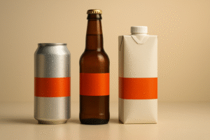
2) Structure First: Formats, Barriers, Closures
Primary formats
-
Aluminum cans (sleek/standard/slim): excellent light/oxygen barrier; fast chilling; great for carbonated and RTD cocktails/seltzers.
-
Glass bottles (flint/amber): premium cues and inert; heavy and breakable; amber improves light protection (beer, kombucha).
-
PET bottles: lightweight, shatter-resistant; custom geometry; pair with tethered caps where required; choose barrier PET for oxygen-sensitive drinks.
-
Cartons (aseptic/Tetra): ambient shelf life for juices, milks, alt-dairy; billboard panels; straw/cap selection affects recyclability and UX.
-
Pouches (spouted): kids/athleisure niches; lightweight shipping; ensure cap child safety and seal strength.
Barriers to engineer
-
Light: amber glass, can opacity, foil layers, sleeve opacity.
-
Oxygen: can + lining; barrier PET/EVOH; oxygen scavengers; crown/cap liners.
-
CO₂ retention: double-seam integrity (cans), crown/twist caps, wall rigidity.
-
Grease/moisture & condensation: varnish choices and label stocks that won’t lift post-pasteurization.
Closures
-
Crown & pry-off/twist caps (beer, kombucha).
-
28mm/38mm finishes (still vs. carbonated PET).
-
Stay-on/tethered caps (regulatory in many regions).
-
Can ends (standard vs. sleek; color-matched tabs for SKU coding).
3) Materials & Line Compatibility (Hot-Fill, Cold-Fill, Aseptic, CSD)
-
Hot-fill PET (juice/tea): panel design for vacuum “paneling” on cooldown; higher resin cost but ambient distribution.
-
Cold-fill + tunnel pasteurization (soda/beer/mixers): labels must survive heat/steam; inks must resist bleed.
-
Aseptic (alt-dairy/juice): multilayer cartons or barrier PET; sterile cap/fitment systems.
-
CSD (carbonated): prioritize seam/crimp, wall thickness, and cap compression set; validate burst/creep specs.
Ask co-packers for line constraints (rinse temp, tunnel curves, labeler type, sleeve tunnel length) before you finalize art.
4) Visual System: The 5-Second Read
Front label/can hierarchy
-
Brand mark (recognition)
-
Variant name/flavor (largest text)
-
Primary promise (e.g., “Zero Sugar • 180mg Natural Caffeine”)
-
Proof icons (vegan, halal, organic, non-GMO, calories)
-
Net contents (mL/FL OZ)
Type & color
-
One hero display face + one legible text family; avoid ransom-note stacks.
-
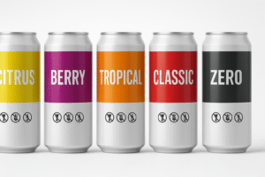
Variant color logic: Citrus = yellow/green, Berry = magenta/purple, Light = silver/white. Lock these across labels, cartons, ads.
Imagery
-
For cans: bold vector/illustrative shapes read best from a distance.
-
For glass/PET: macro fruit splashes or clean gradients; avoid busy photo noise behind small type.
360° thinking
-
Cans rotate: place critical cues in a wraparound band; ensure at least one face has the complete headline without seam breaks.
-
Multipack/shipper art should mirror the can/bottle hierarchy for warehouse picks and retail endcaps.
5) Print Methods & Finishes (Labels, Sleeves, Cans, Cartons)
-
Pressure-Sensitive Labels (PSL): quick to change SKUs; paper vs. film stocks; moisture-resistant adhesives post-pasteurization.
-
Shrink Sleeves (PETG, OPS, PVC): full-coverage 360° canvas; seam planning & distortion maps are critical; consider perforations for recyclability.
-
Direct Can Printing: offset litho for scale; digital can printing is viable for pilots/seasonals—no plates, higher unit cost.
-
Silkscreen/Direct to Glass: premium tactile; check line speeds and color limits.
-
Carton Flexo/Offset: larger billboard; emboss/deboss, foil, spot UV (mind plate counts).
Finishes that help sales (and survive condensation)
-
Matte varnish + gloss hits on claim bursts.
-
Soft-touch on cartons (not on wet zones).
-
Raised varnish/emboss for grip/feel cues.
-
Anti-scuff overprint varnish for cans in logistics.
6) Compliance & Claims (Non-Alcoholic & Alcoholic)
-
Non-alcoholic (varies by region): Nutrition Facts, ingredients (descending), allergen callouts, caffeine disclosure (energy/coffee), sweetener statements, storage/serve chilled, barcode, lot/date.
-
Alcoholic (where applicable): ABV, gov’t warnings, class/type designations, net contents, origin; U.S. brands often require COLA (label approval).
-
Certifications & icons: use only if earned; misuse damages trust.
-
Deposit/return & recycling marks where mandatory.
Pro move: keep a locked Compliance Layer that never shifts relative to dielines or seam margins.
7) E-commerce Readiness (Thumbnail → Unboxing)
-
Front = poster: giant variant name + high contrast; work at 120×120 px first, then scale up.
-
PDP gallery: front hero, 45° angle (nutrition/ingredients visible), lifestyle with condensation beads, in-hand scale, short unboxing/spin GIF.
-
Copy near first image: three proof bullets (“Zero Sugar • 10 Calories • Natural Caffeine”).
-
Renders: photoreal 3D for consistent angles/lighting across flavors, then swap hero shots after product photography.
8) Sustainability (Real Moves That Don’t Kill Margin)
-
Aluminum cans: highly recycled; choose inks/varnishes that don’t complicate recovery.
-
rPET: specify % content; ensure clarity for premium look.
-
Shrink sleeves: design for easy removal (perfs) or use floatable inks/labels to improve bottle recycling streams.
-
Right-sizing: lighter cartons, fewer plates, mono-material shippers; honest end-of-life statements (“recycle where facilities exist”).
9) Workflow That Actually Ships
-
Brief & shelf audit → competitors, flavor map, claim architecture.
-
Structure lock → format, finishes, cap/end specs, seam windows.
-
Territories (2–3) → test at shelf distance and thumbnail size.
-
Refinement + compliance → nutrition/ABV/caffeine/allergens/claims.
-
Prepress → seam/sleeve distortion checks, trapping/overprint, barcode tests.
-
Line trials/proofs → condensation/pasteurization survivability; tweak varnish/adhesive.
-
Asset kit → print-ready PDFs, 3D renders, PDP set, shipper/multipack art.
10) Common Mistakes & Fast Fixes
-
Type too fine for condensation. → Increase weight/contrast; add keylines.
-
Seam steals the headline. → Move claim off seam; add a wrap band.
-
Label lift after pasteurization. → Change adhesive/stock; add anti-lift varnish.
-
Variant chaos. → Lock color bands, icon grid, caffeine/sugar label positions.
-
Unclear caffeine/sugar info. → Put mg/serving and calories on front in a micro-panel.
12) FAQs
Q1. What’s the best package for carbonated drinks?
Aluminum cans or glass with proper closures. Prioritize seam/cap integrity and wall rigidity for CO₂ retention.Q2. Do shrink sleeves hurt recyclability?
They can—use floatable materials/inks or perforations for easy removal; add on-pack recycling guidance.Q3. How do I keep art legible with condensation and pasteurization?
Use moisture-resistant stocks/adhesives, higher type weights, anti-scuff varnishes, and test under line conditions.Q4. What should appear on the front panel?
Brand, variant (largest), a primary promise (sugar/caffeine/calories), and net contents. Move detail to back/side.Q5. Digital can printing vs. traditional?
Digital is perfect for pilots/seasonals and quick turns; offset litho wins on large volumes and lower unit cost.Q6. How do I handle caffeine and sugar claims?
Be precise (mg per serving; calories per can). Match region-specific rules and avoid vague wellness language.Q7. What files do printers need?
Press-ready PDFs on final dielines (with seam/gap windows), outlined fonts, embedded images, CMYK/spot profiles, barcode sized correctly, and sleeve distortion maps if applicable.
Hire Packaging That Sells (and Survives the Line)
Want a beverage system that’s shelf-ready and thumbnail-perfect? Let’s build it—structure → visuals → prepress → launch assets.
See tone/variant systems you can adapt: