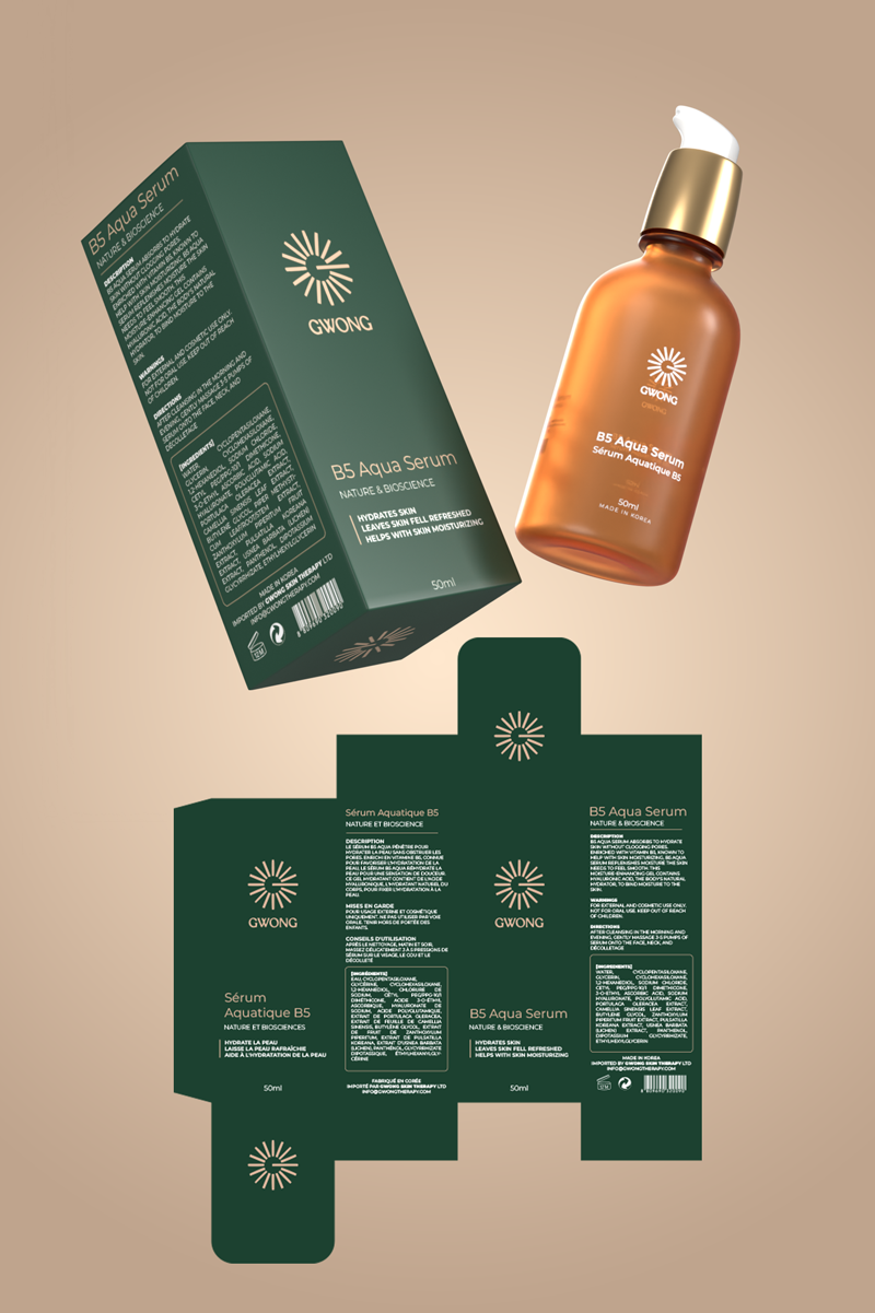
GWONG Light Therapy: Designing a Premium Skincare Label & Packaging System
When Greogry Chan reached out with the vision for GWONG Light Therapy, the brief was ambitious yet precise: create a skin care products label design system that would communicate both luxury and clinical trust. The brand was preparing to launch a full product line including a serum, cleanser, and gel—each needing its own identity while still feeling part of a family. The challenge was to unify these products across bottles, droppers, spray bottles, and retail boxes, and at the same time prepare digital content for the brand’s online presence.
👉 Visit the official brand here: GWONG Light Therapy
The Challenge
The skincare industry is saturated with minimal packaging designs, but many lack a distinct brand voice. For GWONG, the goal wasn’t just to follow trends but to stand out on shelves and screens. Gregory wanted packaging that felt scientifically trustworthy yet visually elegant, suitable for both clinical settings and lifestyle marketing campaigns.
The key objectives were:
-
Build a premium serum label design that would set the tone for the full line.
-
Adapt layouts for cleanser, gel, and spray bottle packaging.
-
Develop box designs that ensure retail readiness and protect delicate products.
-
Provide 3D mockups for e-commerce listings and social media launch campaigns.
Concept Development
The design process began with competitive benchmarking. I analyzed leading skincare brands to understand how typography, spacing, and material finishes influence customer perception. The insights showed that customers valued clarity of use, while visual minimalism created a sense of high value.
The GWONG system was built on three pillars:
-
Clarity – Every product name (Serum, Cleanser, Gel) had to be instantly visible.
-
Elegance – Subtle gradients, modern sans-serif fonts, and calm color palettes reinforced trust.
-
Consistency – Unified grid systems ensured the same DNA across bottles, droppers, and boxes.
For inspiration and technique references, I also leaned on my past experience in supplement packaging, such as this related case: Supplement label design freelancer.
Design Execution
Label & Box Design
Using Adobe Illustrator and Photoshop, I created flexible templates for each product type:
-
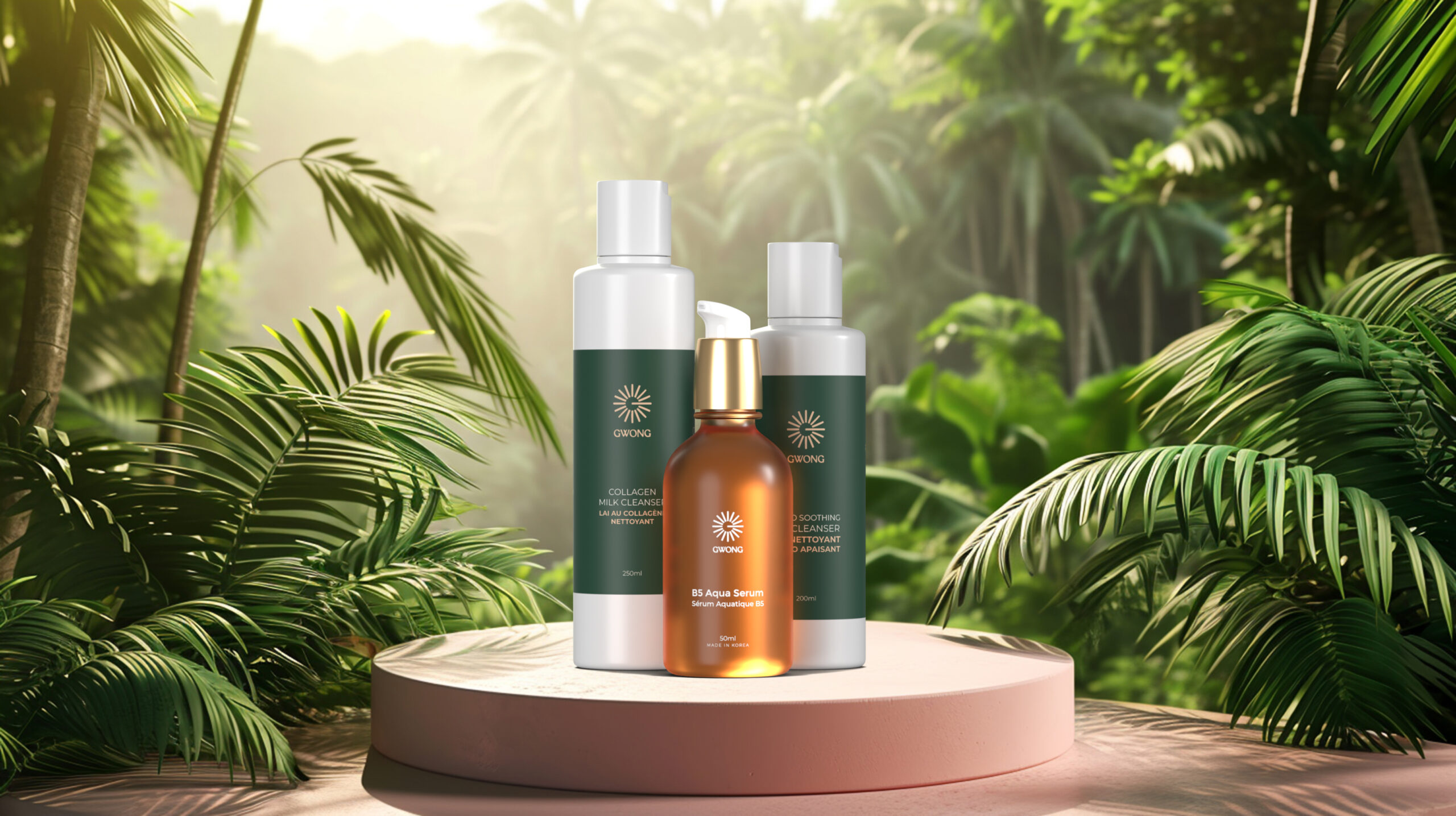
Serum Dropper Bottle – Hero product with elegant typography and a minimalist gold accent.
-
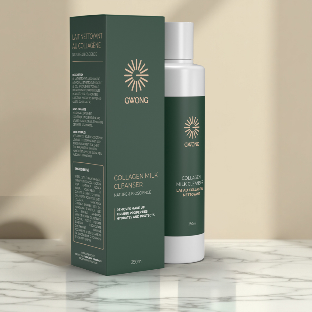
Cleanser Bottle – Slightly bolder layout to accommodate more text while keeping balance.
-
Gel Spray Bottle – Vertical label structure optimized for readability at arm’s length.
-
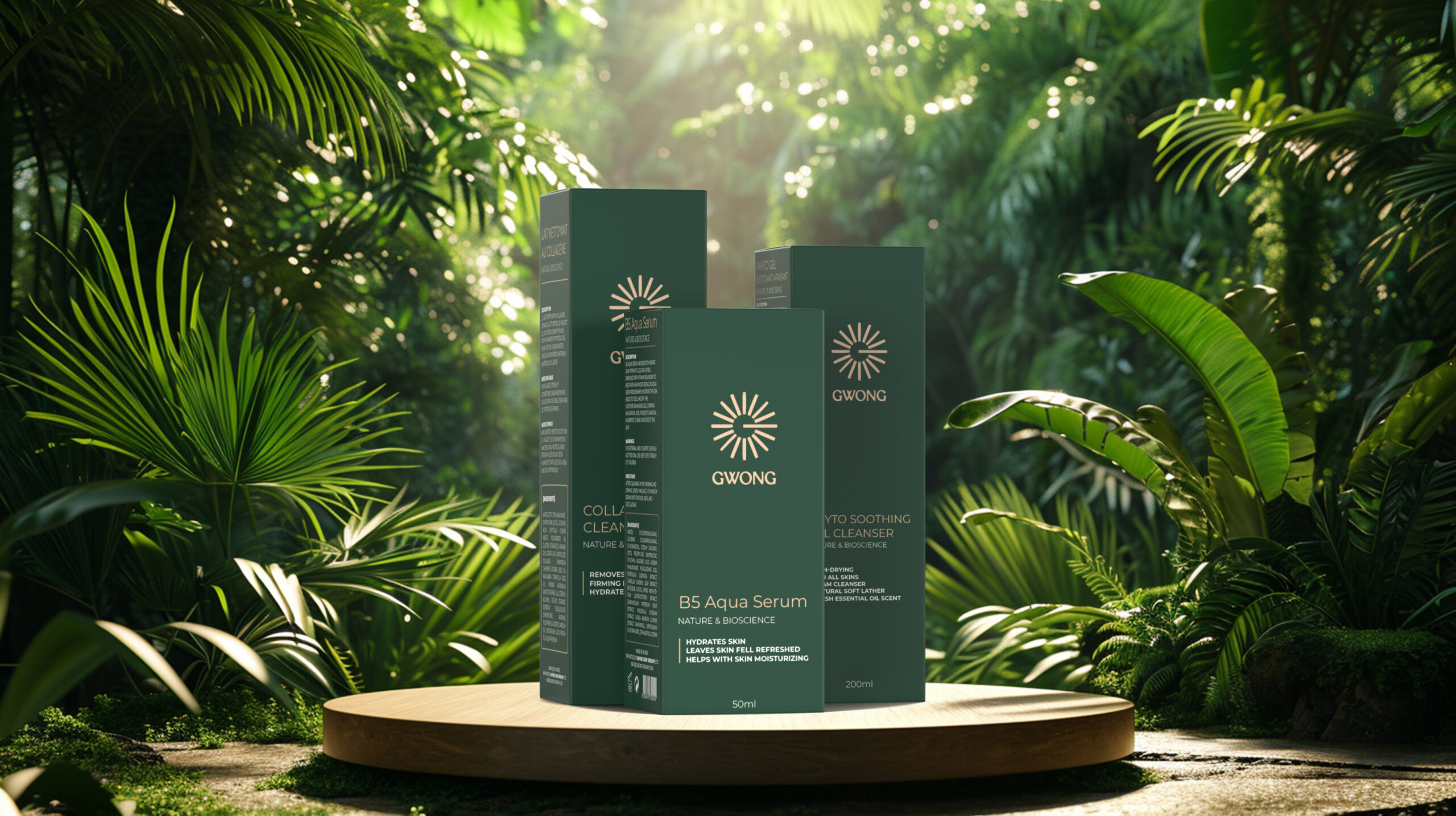
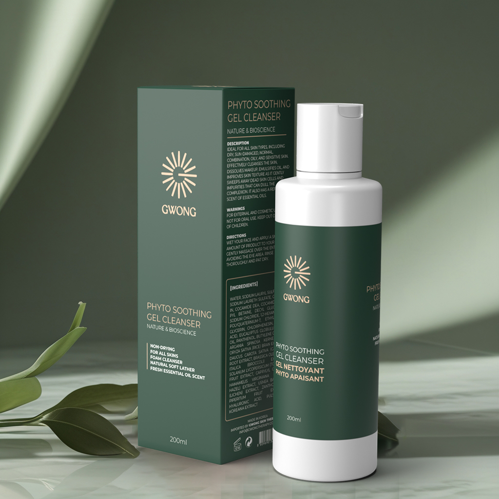
Retail Boxes – Dieline-ready with clear ingredient panels, CMYK setup, and print-safe margins.
3D Mockups
In Blender, I rendered photorealistic visuals of the products with boxes, simulating different lighting setups: soft natural light for e-commerce and high-contrast editorial lighting for social posts. These mockups became assets for both client approvals and digital marketing.
Check my other 3D works here: Umar Animators Portfolio
Social Media Assets
To support the brand’s online presence, I designed Instagram-ready posts and story formats featuring the serum as the centerpiece. The consistency of packaging visuals across social and print ensured a seamless brand rollout.
The Outcome
The final delivery included:
-
Complete skin care products label design system
-
Box artwork with print-ready dielines
-
3D mockups for each product
-
Social media templates for brand launch
The designs positioned GWONG Light Therapy as a premium skincare player. Customers interacting with the brand online or offline see a consistent, polished identity. The photorealistic renders gave the client an immediate advantage—launching marketing campaigns ahead of physical production.
As Gregory mentioned during delivery, “The packaging makes the products feel like they already belong in high-end clinics and beauty stores.”
Why It Worked
This project highlights the impact of a cohesive serum label design system in brand storytelling. By uniting clarity, elegance, and consistency, the packaging not only supports retail sales but also strengthens digital marketing.
It’s proof that skincare packaging design goes beyond just printing labels—it’s about crafting an identity that resonates across physical and digital spaces.
If you’re a wellness or beauty brand looking for packaging that elevates your product line, you can hire me directly on Upwork for end-to-end packaging and 3D mockup solutions.
