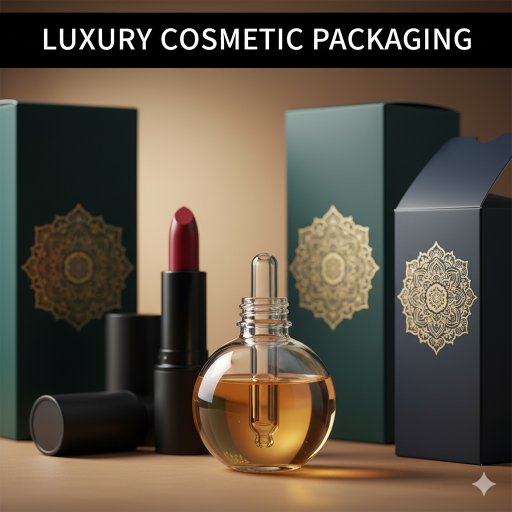
Packaging and Design: Turning Every Box Into a Conversion Engine
In crowded aisles and even more crowded feeds, packaging and design do the heavy lifting before a salesperson ever speaks. Great packaging is not just “pretty”—it’s a system that clarifies benefits in three seconds, survives print realities, and performs on a six-inch screen. When structure (box/label/dieline) and visual design (typography, color, claims) work together, you get standout presence on shelf and high click-through on product pages.
Why “Packaging and Design” (not either/or)
-
Clarity in 3 seconds: Front panel must communicate the product type, key benefit, and variant fast.
-
Shelf to screen consistency: The same hierarchy that wins in retail must stay legible in thumbnails and PDPs.
-
Memory cues: Color families, shapes, and icons create instant brand recall across SKUs.
-
Print reality: CMYK limits, trapping/bleeds, varnish/foil areas, and barcode safe zones are design decisions too.
A Practical 5-Step Framework (from brief to buy)
-
Strategy & Positioning
Define audience, price tier, and competitive whitespace. Set the messaging stack (hero claim → variant → supporting proof). -
Visual Hierarchy & Copy
Headlines sell the promise, subheads add credibility, microcopy handles compliance. Keep 1–2 hero claims; anything more dilutes impact. -
Structure & Dielines
Choose the right format—folding carton, label, pouch, or tin—based on COGS, durability, and retail requirements. Keep cutter guides, creases, and bleed clearly annotated. -
Pre-Press & Finishes
Plan Pantone bridges, ink coverage, spot varnish or foil, and ensure barcode contrast and quiet zones. Always review digital and hard proofs. -
E-commerce Assets & Unboxing
Produce a PDP hero, 4–6 gallery images (front, back, side, top seal, size-in-hand), plus a lifestyle shot. For unboxing, minimal inserts (thank-you card, sticker) lift perceived value.
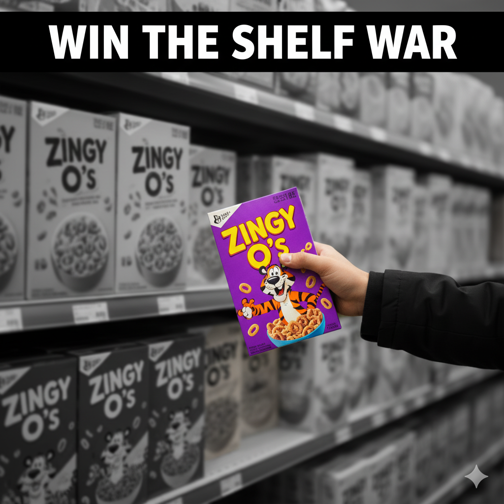
Micro Case Study: Flavor-First Energy That Pops
We elevated a bubblegum-inspired energy SKU with bold color blocking, flavor-forward typography, and a clean front-panel claim hierarchy—designed to “read” in-store and as a 320px thumbnail. Realistic 3D renders sharpened PDP clarity and improved add-to-cart confidence.
👉 See the build: Kickballz Product Packaging Design
👉 Ready to move? Hire Usman for Packaging & Design
Materials & Sustainability (without losing shelf appeal)
-
Reduce first: Smart structure and right-sized cartons cut cost and footprint.
-
Recognizable eco signals: Use clear, credible recycling icons and keep them legible.
-
Selective premium: Matte base with spot gloss or restrained foil delivers premium feel without over-ink or glare issues.
Common Mistakes (and quick fixes)
-
Everything is loud; nothing is readable: Limit to one hero promise and one proof point.
-
Barcode problems: Maintain contrast and quiet zone; test scans at 80–100% size.
-
Tiny typography: If it’s unreadable at mobile thumbnail size, rework hierarchy.
-
Color surprises at press: Use Pantone bridges, request drawdowns, and keep critical hues out of rich blacks.
Packaging for E-commerce Conversion
-
Thumbnail test: Shrink the front panel to 320px—can you still read the hero claim and variant?
-
Angle discipline: PDP hero at ~30–35° with soft shadows; avoid over-perspective that warps proportions.
-
Context shot: “In hand” or beside a familiar object communicates size better than text alone.
-
Bundle logic: If you sell multipacks, align colorways and panel rhythm so the set photographs as a family.
Process, Timelines, and Ballparks
-
Typical timeline: 3–6 weeks for a single label refresh; 8–12 weeks for a new structural system and multi-SKU family.
-
Investment drivers: Number of SKUs, structural development, finish complexity, and 3D/PDP asset depth.
How to Choose the Right Partner (quick checklist)
-
Proven work in your category (F&B, supplements, cosmetics, vape, home).
-
Pre-press fluency (trapping, ink limits, varnish/foil callouts).
-
Retail + DTC mindset (planograms and PDPs considered together).
-
Clean, milestone-based process and supplier coordination.
FAQs: Packaging and Design
1) What matters more—structure or graphics?
Both. Structure controls cost, durability, and feel; graphics control clarity and brand memory. The win comes from aligning both to a single promise.
2) How many concept rounds should I expect?
Two to three routes, then two to three refinement rounds, plus printer proofing and any structural sampling.
3) Do I need barcodes/GTINs before design?
It helps. Design can reserve space, but GTIN assignment and barcode specs should be locked before pre-press.
4) What’s the fastest way to level up my current pack?
Tighten the hierarchy (one hero claim), increase contrast, verify barcode, and add a clean PDP image set.
5) Can you handle 3D renders for e-commerce?
Yes—photoreal renders ensure consistent angles, lighting, and speed across variants.
Call to Action
Want packaging that sells on shelf and screen? Review the process and visuals here: Kickballz Product Packaging Design — then let’s align on your SKUs, finishes, and PDP deliverables.