Design Your Packaging
Table of Contents
-
Industry Context: Why 2025 is different
-
Services & Features you need to design your packaging
-
Scorecard: 12 evaluation points
-
Process (strategy → dieline → prepress → print)
-
Visual System & Information Hierarchy
-
Compliance & Risk Controls (non-legal)
-
Print Methods & Finishes
-
E-commerce Readiness (thumbnail → PDP → unboxing)
-
Sustainability (real, not greenwashing)
-
Common Mistakes & Quick Fixes
-
Files, Color & Prepress (what printers need)
-
Timelines, MOQs & Cost Levers
-
Hire CTA + Internal Portfolio Links
Industry Context: Why 2025 is different
-
Speed & SKU sprawl: Short cycles, line extensions, and DTC drops require master templates that update fast.
-
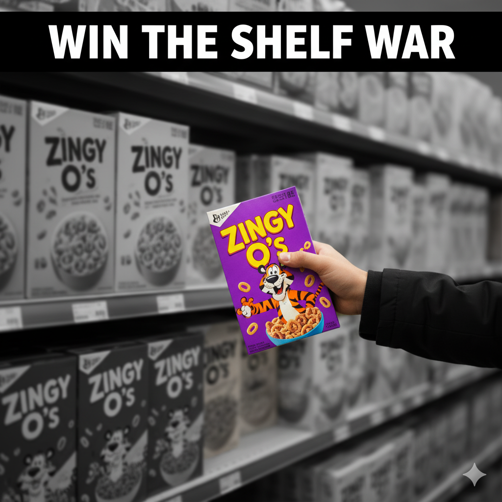
Thumbnail commerce: Your PDP must read at 120–160 px, so strength/variant and key benefits must be bold and short.
-
Proof-driven color: Pantone LAB targets, ΔE readouts, and honest renders beat flashy mockups.
-
Sustainability pressure: Retailers favor mono-material structures, water-based coatings, and transparent disposal guidance.
-
Global supply volatility: Standardized specs and dual-sourcing help you design your packaging once and print anywhere with minimal drift.
Services & Features you need to design your packaging
-
Brand & pack architecture: SKU naming, variant logic, type scales, color families.
-
CAD dielines: cartons, labels, pouches, tubes, trays, shippers; bleed ≥ 3 mm, safety 3–5 mm.
-
Prepress governance: trapping 0.08–0.12 mm, overprint/knockout maps, rich black policy, total ink limits.
-
Color management: Pantone masters + LAB values, ΔE ≤ 2.0, CMYK simulations.
-
Anti-counterfeit (when needed): microtext, UV inks, serialized QR with quiet zone ≥ 2.5 mm.
-
E-comm toolset: hero angles, macro finish shots, dieline/leaflet downloads, AR/3D mockups.
-
Sustainability roadmap: mono-material swaps, caliper right-weighting, disposal iconography.
Scorecard: 12 evaluation points
-
Front hierarchy: brand → product → variant/strength → net contents.
-
Legibility: body x-height ≥ 2.6–2.8 mm; contrast ≥ 4.5:1.
-
Barcode/QR: clear quiet zone ≥ 2.5 mm; graded A/B.
-
Bleed & safety: ≥ 3 mm bleed, 3–5 mm safety; nothing critical near creases.
-
Trapping: 0.08–0.12 mm at ink joins; no overprint on small text ≤ 8 pt.
-
Color control: Pantone + LAB; ΔE ≤ 2.0 to master.
-
Material fitness: board/film meets scuff, crush, MVTR/OTR (if needed).
-
Finish discipline: foil/spot gloss outside regulatory copy and barcodes.
-
E-comm readability: variant readable at 120–160 px.
-
Sustainability signals: credible claims, disposal icons by region.
-
Version control: rev codes on artboard and file names.
-
Vendor readiness: at least two approved plants with matched specs.
Process (strategy → dieline → prepress → print)
-
Strategy & brief
Define audience, channels (retail vs DTC), volumes, regions, and competitive shelf + thumbnail tests. Decide how you’ll design your packaging to scale across variants. -
Content matrix
Lock exact copy order: claims, legal, nutrition/ingredients/actives, certifications, batch/expiry fields. Pre-count characters to avoid last-minute reflows. -
Master visual system
12-column grid, type ramp (H1/H2/body/captions), icon family (dose, recycle, CR, QR), color logic by variant. -
CAD & mechanics
Build dielines with 3 mm bleed and 5 mm safety; annotate fold/glue/TE; add barcode/QR zones and overprint/knockout legend on the pasteboard. -
Prototype & tests
White dummy + printed comps; check hinge/tuck behavior, scuff resistance, barcode scans, and shelf/thumbnail legibility. -
Prepress
-
Images 300 ppi @100%; line art 1200 ppi.
-
Trapping 0.08–0.12 mm; small text = knockout, not overprint.
-
Rich black only for large fills (e.g., C60 M40 Y40 K100); never for fine text.
-
Barcodes at spec magnification; quiet zone ≥ 2.5 mm; test to ISO/ANSI.
-
-
Color sign-off
Hard proof, LAB targets, ΔE readouts; reject anything outside tolerance. -
Press run & QC
Capture coating weights, ΔE report, barcode grades; file press OK photos. -
Handover kit
Locked PDFs, source files, color bible, preflight report, revision log—so future you can design your packaging updates without drama.
Visual System & Information Hierarchy
-
Top band: brand + product family.
-
Primary signals: variant/strength, key RTB (1–2 words), count/volume.
-
Secondary: usage icons, certifications, sustainability icons.
-
Tertiary: nutrition/actives tables, ingredients, legal line, batch/expiry windows.
-
Color coding: not color-only—add patterns or alphanumeric codes; protect small text on white/95% tints.
-
Micro-layout: keep codes 6–8 mm away from edges/folds; align baselines across panels.
Compliance & Risk Controls (non-legal)
-
Maintain a controlled master copy with version history.
-
Avoid color-only differentiation where safety matters; add distinct symbols or patterns.
-
Keep UID/serialization space even if not used at launch.
-
Place tamper cues (arrows, “Lift to open”) where TE is present.
-
Use disposal guidance relevant to key markets; link via QR for regional details.
(Guidance only—validate with your regulatory team.)
Print Methods & Finishes
-
Litho offset for cartons/inserts (best for fine type).
-
Flexo for labels/corrugate; plate count impacts cost.
-
Digital (Indigo/inkjet) for pilots, low MOQs, variable data.
-
Finishes: aqueous matte/satin (healthcare/clean feel), soft-touch sparingly (shows scuffs), spot gloss away from warnings/codes, cold foil for accents, emboss/deboss aligned to grain.
-
Security (if relevant): UV inks, microtext, guilloché, tamper labels.
E-commerce Readiness (thumbnail → PDP → unboxing)
-
Thumbnail: variant readable at 120–160 px; plain background; avoid tiny claims.
-
PDP gallery (6–8 images): hero, side info table, macro finish, barcode/QR placement with quiet zone, inside-lid/leaflet view, size in hand, pallet/shipper shot.
-
Downloads: AI/PDF dielines, prepress checklist, color bible, disposal guide PDF.
-
Unboxing: inside-lid quick-start or insert; QR to short how-to video.
-
Color honesty: renders must match ΔE to physical pack—no oversaturation.
Sustainability (real, not greenwashing)
-
Right-weighting: reduce caliper where compression allows; publish the gram savings.
-
Mono-material: paper tray or molded pulp instead of mixed laminations when possible.
-
Coatings: water-based over plastic laminations unless barrier is necessary.
-
Disassembly: avoid glued mixed materials; print clear disposal icons; link QR to region-specific guidance.
-
Claim discipline: recycled % and certifications only—no vague “eco friendly”.
Common Mistakes & Quick Fixes
-
Artwork doesn’t fit machinery → Add chamfers on tight folds; review glue flaps and tuck lengths.
-
Barcode fails → Move off seams; increase contrast; quiet zone ≥ 2.5 mm; re-grade to A/B.
-
Overprint on fine text → Force knockout ≤ 8 pt; check Overprint Preview.
-
Color drift across vendors → One color bible; press OK at each plant; ΔE ≤ 2.0.
-
Scuffed cartons → Increase coating weight or switch to satin; test against shipper rubs.
-
Slow PDP conversions → Add dieline blueprint and prepress tab; make RFQ sticky.
Files, Color & Prepress (what printers need)
-
Finals: PDF/X-1a or X-4; fonts outlined; embed profiles; source files archived.
-
Layers (non-printing): dieline, fold, glue, varnish, foil, emboss, white ink, security, barcode/QR zones, overprint/knockout legend.
-
Bleed ≥ 3 mm; safety 3–5 mm; no critical text near creases.
-
Images 300 ppi; line art 1200 ppi; total ink limit per press profile.
-
Pantone governance: book name + LAB; define tolerances (ΔE ≤ 2.0).
-
Barcodes/QR: magnification, height, location; quiet zone ≥ 2.5 mm; sample scans included.
-
Preflight report: color spaces, overprints, fonts, resolution, trim box.
Timelines, MOQs & Cost Levers
-
Strategy + system: 1–2 weeks
-
CAD + comps: 5–7 days
-
Prepress + proofs: 3–5 days
-
Printing: digital 3–5 days; offset 10–14 days incl. drying & QC
-
MOQs: digital 100–500; offset 5k–20k; flexo labels 5k+
-
Levers: shared dies, standardized calipers, fewer spot colors, gang runs, localize artwork not structure
Hire Us + Internal Portfolio Links
Want to design your packaging once and scale it everywhere? We build master templates, enforce color control, and deliver factory-ready files—jaldi, without compromising quality.
-
Supplements & label systems (regulated hierarchy discipline):
https://usmandesigner.com/portfolio/supplement-label-design-freelancer/ -
High-fidelity consumer packs & 3D visuals:
https://usmandesigner.com/portfolio/vape-packaging-design-store/ -
Premium cartons & complex dielines:
https://usmandesigner.com/portfolio/sushi-packaging-design/FAQs
1) What’s the first step to design your packaging?
Define audience, channels, and volumes; then lock a content matrix before visual design to avoid rework.2) Do I need Pantone or can I stick to CMYK?
For brand colors or variant families, anchor with Pantone + LAB; simulate CMYK if ΔE ≤ 2.0 on press.3) How big should my bleed be?
Use ≥ 3 mm on all sides, with 3–5 mm safety for text and codes.4) Why do barcodes fail at warehouses?
Usually missing quiet zones, low contrast, or placement on a fold. Grade to A/B before sign-off.5) What is trapping and why care?
It’s a micro overlap (0.08–0.12 mm) to prevent gaps where inks meet; essential for crisp edges.6) How do I make my pack greener without huge cost?
Right-weight caliper, switch to water-based coatings, and prefer mono-material structures; publish disposal guidance via QR.7) When should I use digital vs offset printing?
Digital for pilots/low MOQs/variable data; offset for stable SKUs and tighter unit cost with strict color control.