Food Packaging Design Agency: Structure, Safety & Shelf Impact (That Actually Sells)
If you’re hunting for a food packaging design agency, you need more than “nice graphics.” Food packs must protect (barriers, seals), inform (nutrition, allergens), and sell (thumbnail-ready visuals) — all while staying cost-smart and scalable across flavors and formats. This long-form guide shows you what a great agency does, how the process works, what to watch out for, and how to judge quality before you print a single pouch or carton.
Table of Contents
-
Why Use a Food Packaging Design Agency
-
What’s Unique About Food (vs. other CPG)
-
Structure Before Surface: Formats, Barriers, Closures
-
Visual System for Shelf & Thumbnail
-
Compliance & Labeling Without Last-Minute Tetris
-
Printing, Finishes & Cost Controls
-
E-commerce Readiness (From 120×120 px to Unboxing)
-
Sustainability (Real, Not Green-washing)
-
Step-by-Step Process You Should Expect
-
Common Mistakes & Fast Fixes
-
Image Prompts (Hero, Variants, Eco, Compliance, Dieline)
-
FAQs
-
Rank Math Data (Copy-Paste)
1) Why Use a Food Packaging Design Agency
A specialized agency connects four pillars end-to-end:
-
Strategy: positioning, audience triggers, claim architecture (benefit + 2–3 proofs).
-
Structure: real dielines, correct materials & barriers, seal/closure choices, shipping reality.
-
Visuals: hierarchy that wins at 2 meters and at 120×120 px.
-
Production: nutrition/allergens/barcodes laid out right; prepress + printer liaison.
See a clean food example blending structure with bold flavor color bands: Sushi Packaging Design →
Playful confectionery tone with strong variant cues: KickBallz Candy Packaging →
2) What’s Unique About Food (vs. other CPG)
-
Shelf life depends on OTR/WVTR barrier tuning (oxygen/moisture).
-
Allergens and nutrition panels must be correct and legible.
-
Grease/oil can bleed through stocks if liners aren’t specified.
-
Food-safe inks & finishes matter; some laminations affect recyclability.
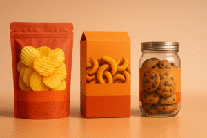
3) Structure Before Surface: Formats, Barriers, Closures
Formats
-
Flexible: stand-up pouches, flow wraps (snacks, coffee, treats). Great billboard, low freight.
-
Rigid: jars/tubs/tins (premium cues, stackability). Watch weight/breakage.
-
Cartons & Sleeves: storytelling area; pair with inner film/tray for hygiene.
-
Multipacks: outer impact + inner convenience (portion cues, easy-open).
Materials & Barriers
-
OPP/CPP/PET laminates tuned for OTR/WVTR.
-
Kraft/paperboard with grease-resistant liners for oily items.
-
Glass/metal for max barrier; consider freight & handling.
-
MAP/Vacuum for perishables; design headspace visuals.
Seals & Closures
-
Zippers, tear-notches, tamper bands; design the first-open moment into experience.
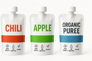
4) Visual System for Shelf & Thumbnail
Front-panel hierarchy (5-second read):
-
Brand mark
-
Variant/Flavor (largest text)
-
Primary benefit (“Air-Fried • 40% Less Oil”)
-
Proof icons (non-GMO, halal, vegan, gluten-free)
-
Net weight
Type & Color
-
One display face + one highly legible text family.
-
Assign variant colors (Chili=red, Lime=green, Sea Salt=blue) and lock them across packs, web, and ads.
Imagery
-
Appetite-appeal macros or consistent 3D renders. Standardize the hero angle for the whole line.
5) Compliance & Labeling Without Last-Minute Tetris
-
Nutrition facts & ingredients per target market.
-
Allergen statement (“Contains: …”) and/or bold allergens in the list.
-
Storage/Use (“Keep refrigerated,” “Consume within 3 days”).
-
Origin/Batch/Lot/Barcode with proper quiet zones.
-
Certs (organic/halal/kosher/vegan) only if earned.
-
Translations: dedicate a localization panel or QR for overflow.
Pro move: keep a locked Compliance Layer in your source file aligned to the dieline.
6) Printing, Finishes & Cost Controls
-
Digital = short runs, pilots, seasonal tests.
-
Flexo = scale; good unit cost for snacks/CPG.
-
Gravure = very high volumes, tight color control.
Finishes: matte (modern), soft-touch (tactile), spot UV/foil (sparingly for logo/claims).
Smart savings: one base pouch + variant labels; limit plate count; right-size the pack.
7) E-commerce Readiness (From 120×120 px to Unboxing)
-
Front panel = poster. Big variant name + bold color band.
-
PDP gallery: front hero, angled back (nutrition/allergens), lifestyle, in-hand scale, short unboxing GIF.
-
Copy near first image: three short proof bullets.
-
3D first: renders unify angles/lighting; swap hero to photos after production.
8) Sustainability (Real, Not Green-washing)
-
Right-size the pack; reduce void and ink plates.
-
Prefer mono-materials where possible for simpler recycling streams.
-
Be specific about end-of-life (“recycle where facilities exist”).
-
Test finishes on actual stock; some foils/laminates degrade recyclability.
9) Step-by-Step Process You Should Expect
-
Discovery & Brief — goals, channels (retail/DTC/q-commerce), claims.
-
Shelf Audit — 3–5 competitors; what to respect vs. break.
-
Structure First — lock dielines, materials, closures, compliance zones.
-
Concept Territories (2–3) — stress-tested at thumbnail size.
-
Refinement + Compliance — nutrition, allergens, barcodes, translations, certs.
-
Prepress Setup — CMYK/spot, trapping, overprint, barcode scale; proofing.
-
Production & QA — vendor liaison, stock/ink tweaks, first-article approval.
-
Launch Assets — 3D renders, lifestyle frames, PDP kit, unboxing GIF, social cutdowns.
10) Common Mistakes & Fast Fixes
-
Everything screams on front. → Enforce hierarchy; push story to side/back.
-
Grease bleed on kraft. → Specify grease-resistant liners or change stock.
-
Barcode fails at checkout. → 100% black on white; correct quiet zone; test at print scale.
-
Variant chaos. → Lock color bands + icon grid + naming rules.
-
Thumbnail mush. → Larger variant, fewer words, stronger contrast.
12) FAQs
Q1. What’s the best material for oily snacks?
Use laminates with grease + oxygen barriers (e.g., metallized films/OPP laminates) or lined paper; confirm shelf life with your co-packer.Q2. How big should the flavor name be?
Make the variant the largest text after the brand. Test legibility at 120×120 px.Q3. Do I need halal/kosher/vegan icons?
Only if certified. Icons raise trust where buyers care; misuse backfires.Q4. Digital vs. flexo vs. gravure for food packs?
Digital for pilots/short runs/seasonals; flexo for scale; gravure for very high volumes with tight color.Q5. How do I handle multi-language packs?
Plan a dedicated localization panel or add a QR for overflow. Don’t cram micro text on the front.Q6. What files will the printer need?
Press-ready PDFs on final dielines (1:1), outlined fonts, embedded images, CMYK/spot profiles, correct barcode size, and compliance panels.
Hire a Food Packaging Design Agency That Ships
Want a system that’s shelf-ready and thumbnail-perfect? Start with real-world tones: